
THE CORPORATE IDENTITY
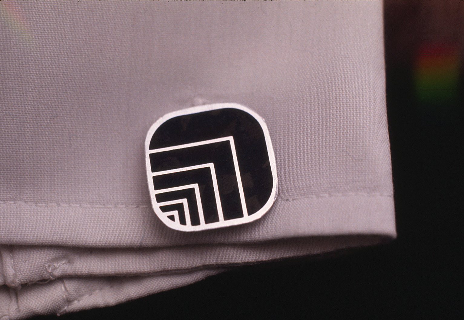
The Corporate Signature should be adaptable to it’s use in positive and negative graphic applications.
Originally retained by Skidmore, Owings & Merrill to develop an architectural graphics program for Edmonton Centre, a mixed use office / retail complex in downtown Edmonton.
The Canadian Developer, OXFORD PROPERTIES then retained our services to develop a Corporate Identity program and provide architectural graphic services for all their future projects, including marketing and promotional materials.
The Canadian Developer, OXFORD PROPERTIES then retained our services to develop a Corporate Identity program and provide architectural graphic services for all their future projects, including marketing and promotional materials.
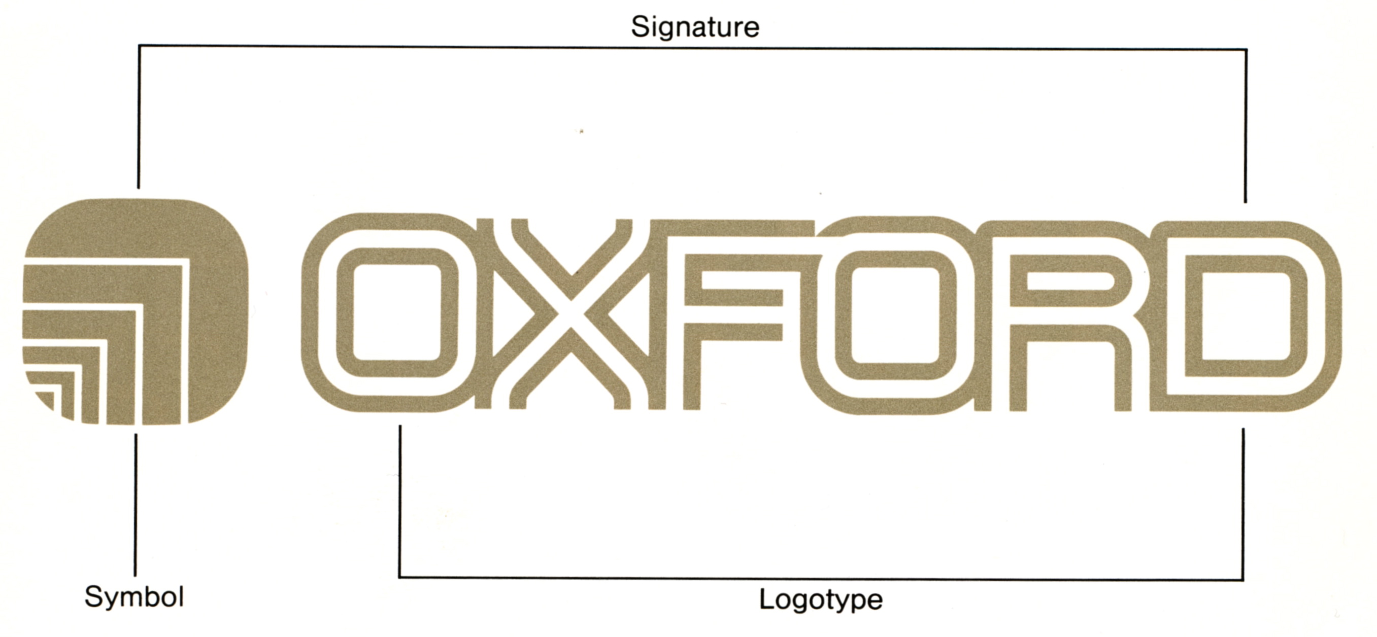
The Symbol + the Logotype create the OXFORD Signature.

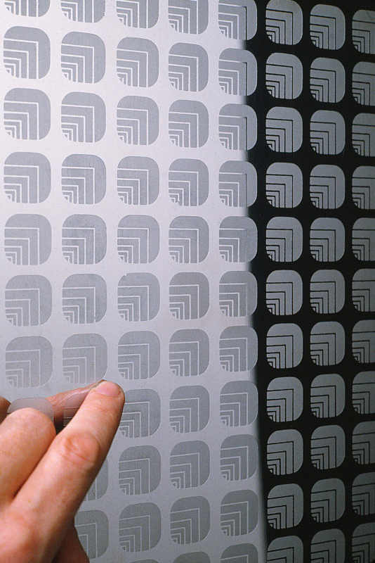
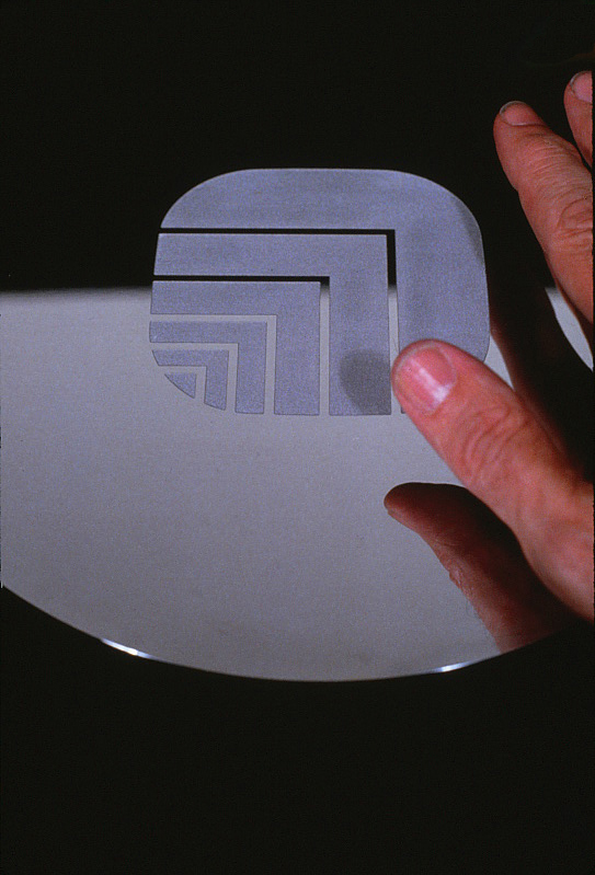
Repeat patterns of the symbol can be used in a variety of ways, including print and / or architectural applications.
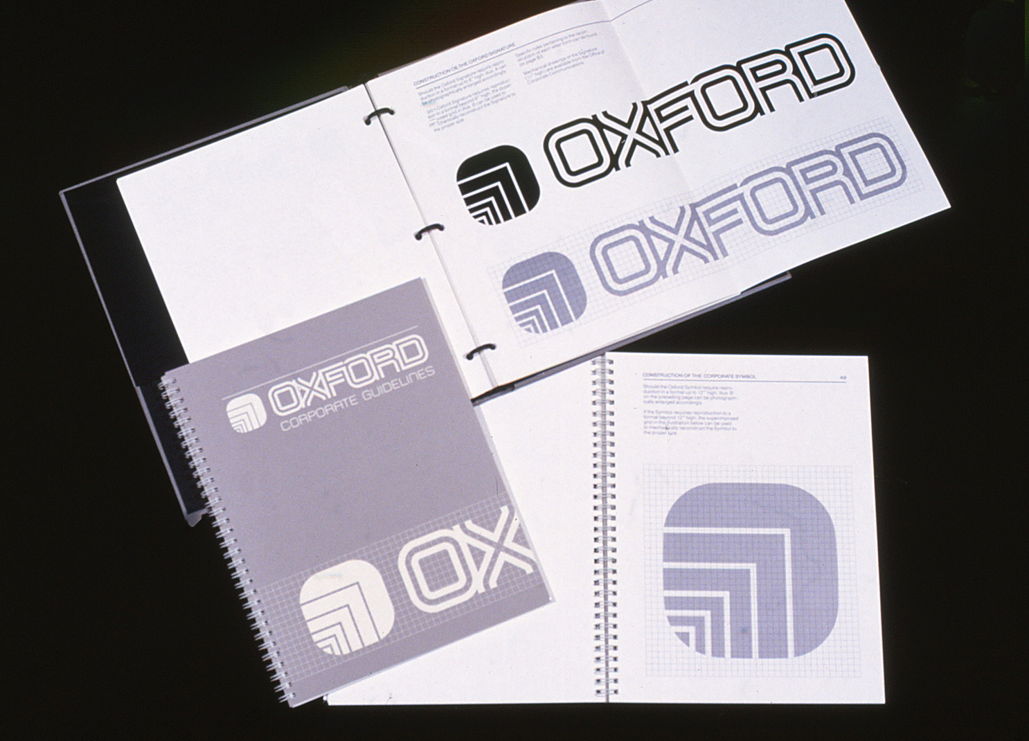
THE GRAPHIC STANDARDS MANUAL
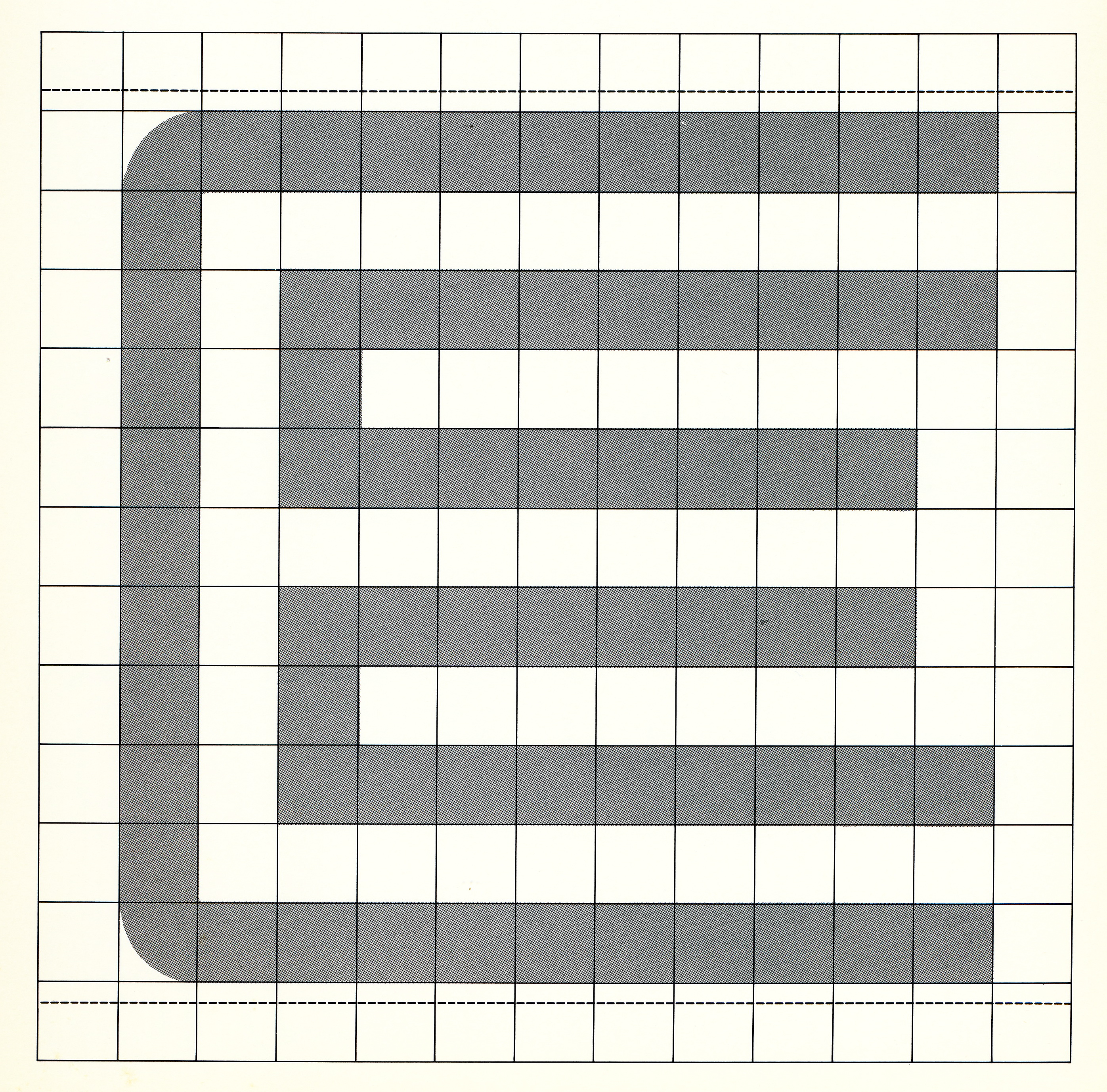
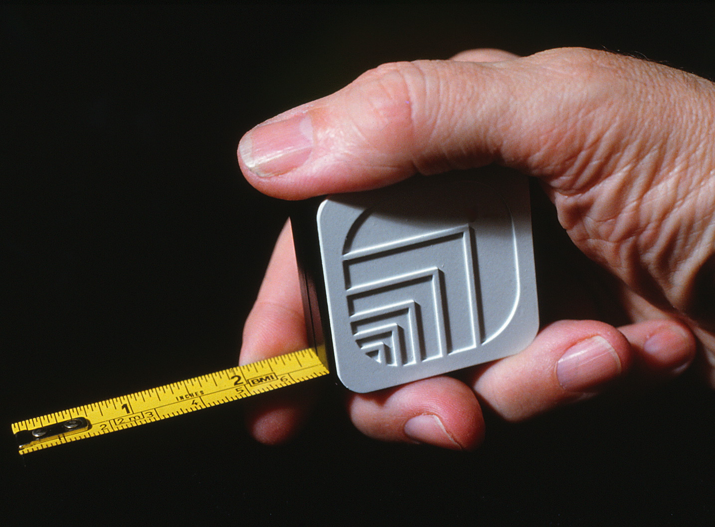
Sketch phase for developing the OXFORD Corporate Symbol.
A 48 page Graphic Standards Manual was prepared for distribution
to all Corporate Offices in the US and Canada.
to all Corporate Offices in the US and Canada.
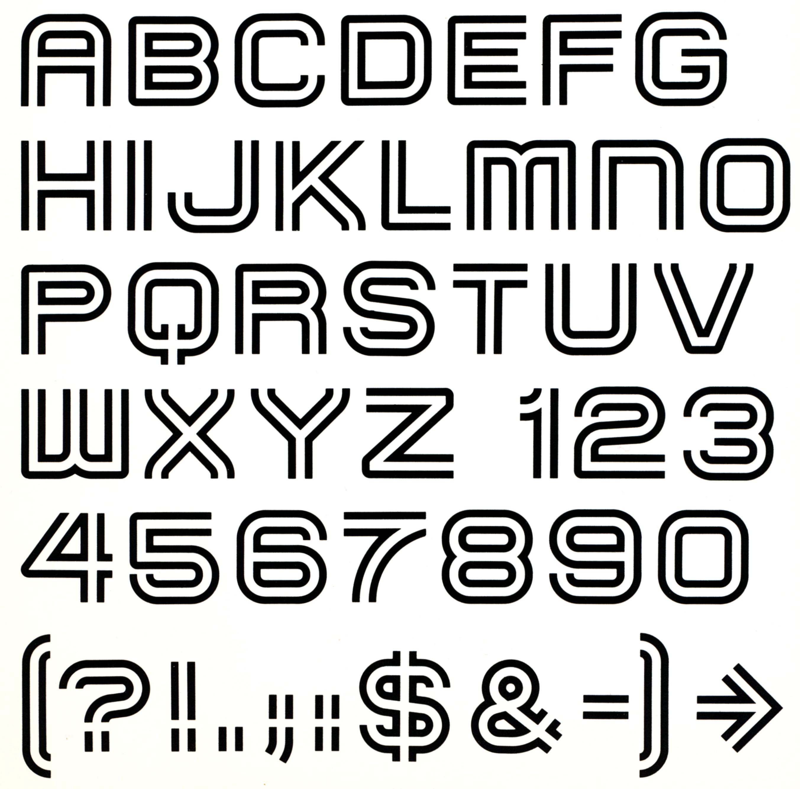
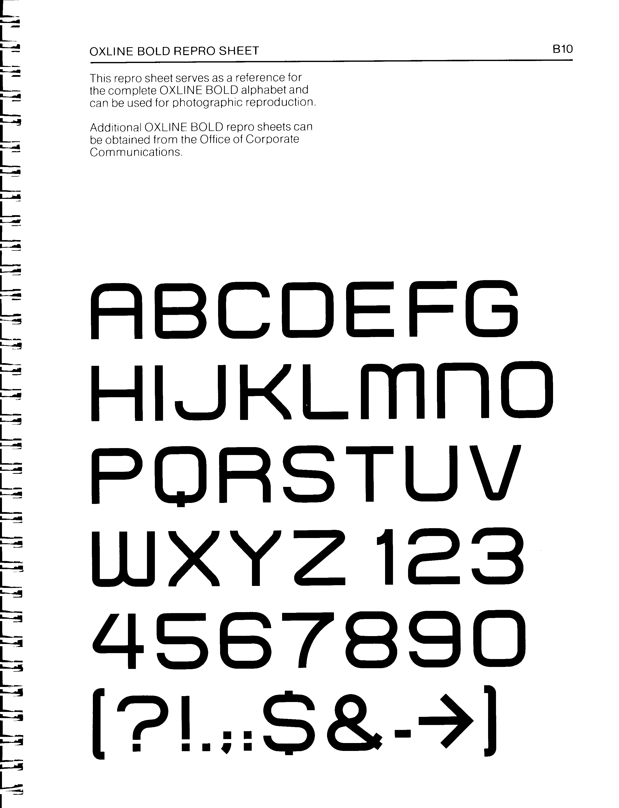
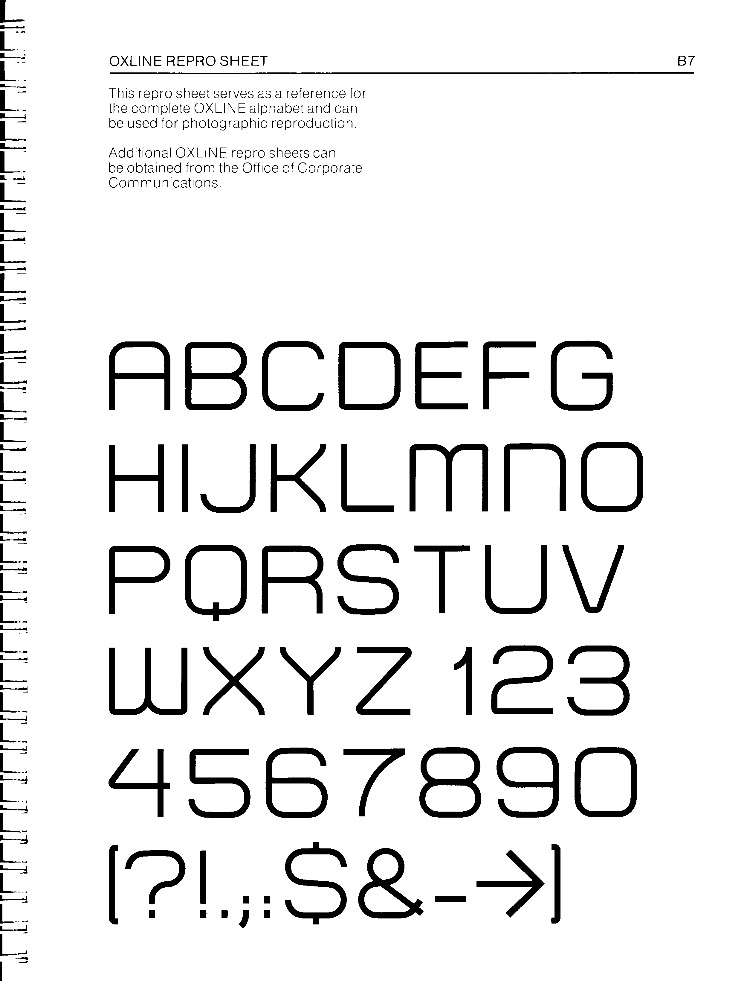
The double-stroke font was developed
into a complete alphabet and numbers.
into a complete alphabet and numbers.
THE CORPORATE BROCHURE & FOLDER
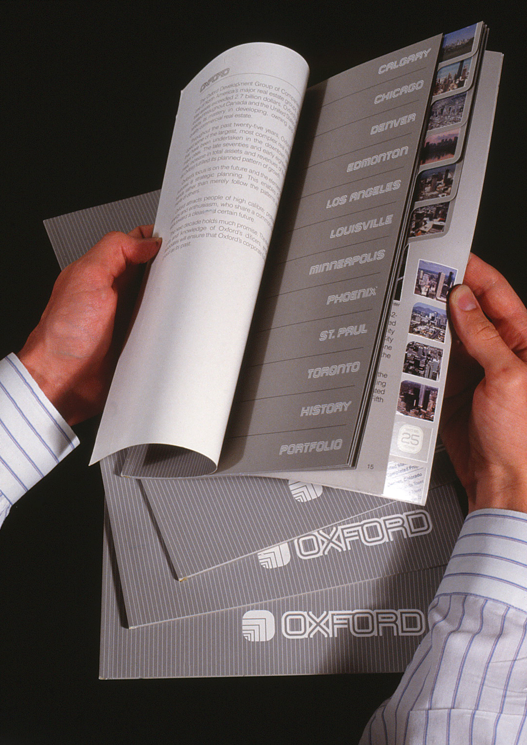
The die-cut tabs provided a quick visual index all of OXFORD’s projects in the US and Canada.
The design of the Corporate brochure focused on the variety of OXFORD projects throughout North America. The concept of a tabbed dictionary format facilitates a quick visual reference to each project city.
EDMONTON / EDMONTON CENTER
CALGARY / TD SQUARE
CHICAGO / QUAKER TOWER / RIVERFRONT PARK
DENVER / REPUBLIC PLAZA
LOS ANGELES / CITICORP PLAZA
LOUISVILLE / THE GALLERIA
MINNEAPOLIS / MINN. CITY CENTER / IDS CENTER
ORLANDO / LAKE BUENA VISTA
ST. PAUL / TOWN SQUARE
CALGARY / TD SQUARE
CHICAGO / QUAKER TOWER / RIVERFRONT PARK
DENVER / REPUBLIC PLAZA
LOS ANGELES / CITICORP PLAZA
LOUISVILLE / THE GALLERIA
MINNEAPOLIS / MINN. CITY CENTER / IDS CENTER
ORLANDO / LAKE BUENA VISTA
ST. PAUL / TOWN SQUARE
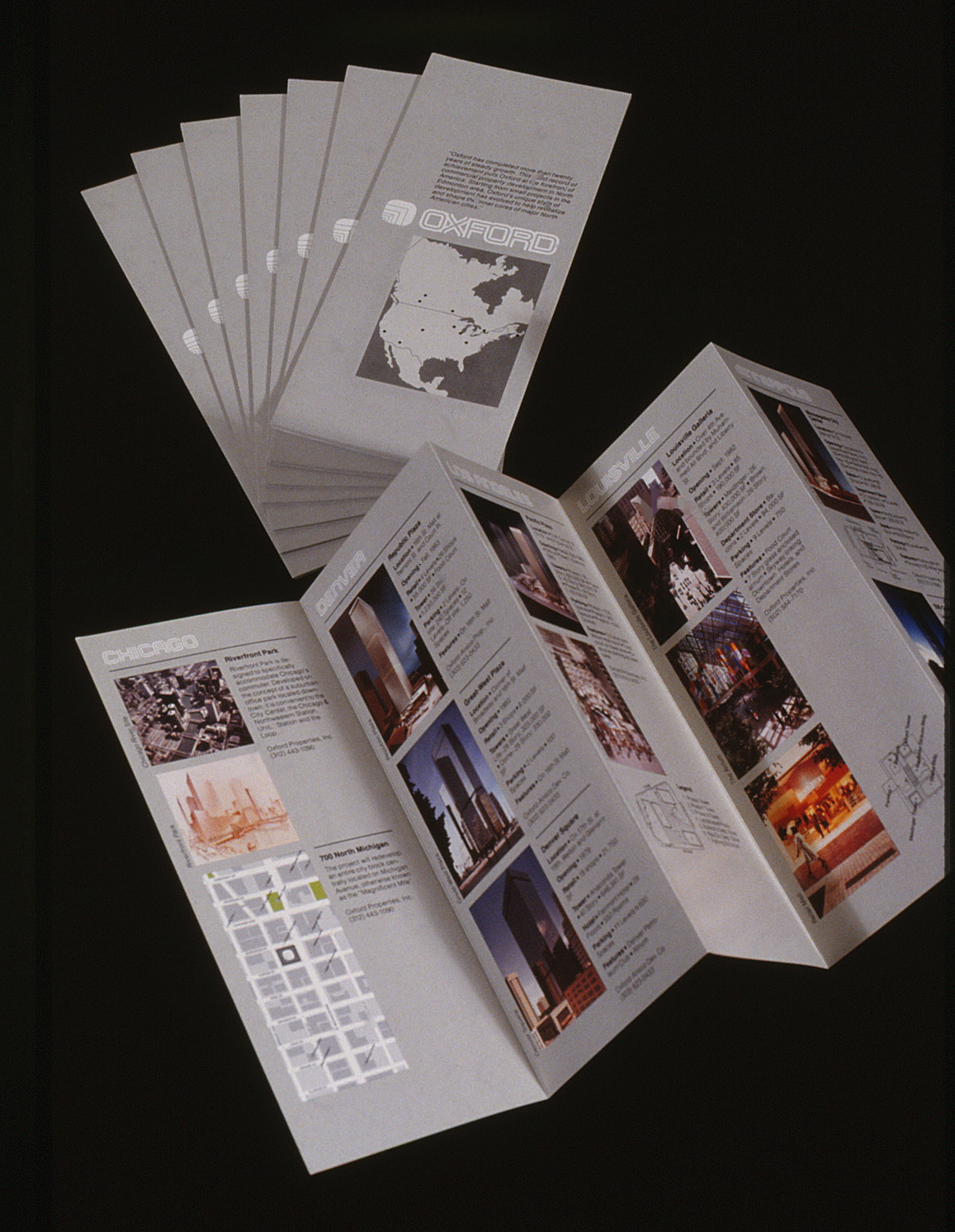
A less costly version of the brochure is a fold-out mailer to be sent to all prospective tenants.
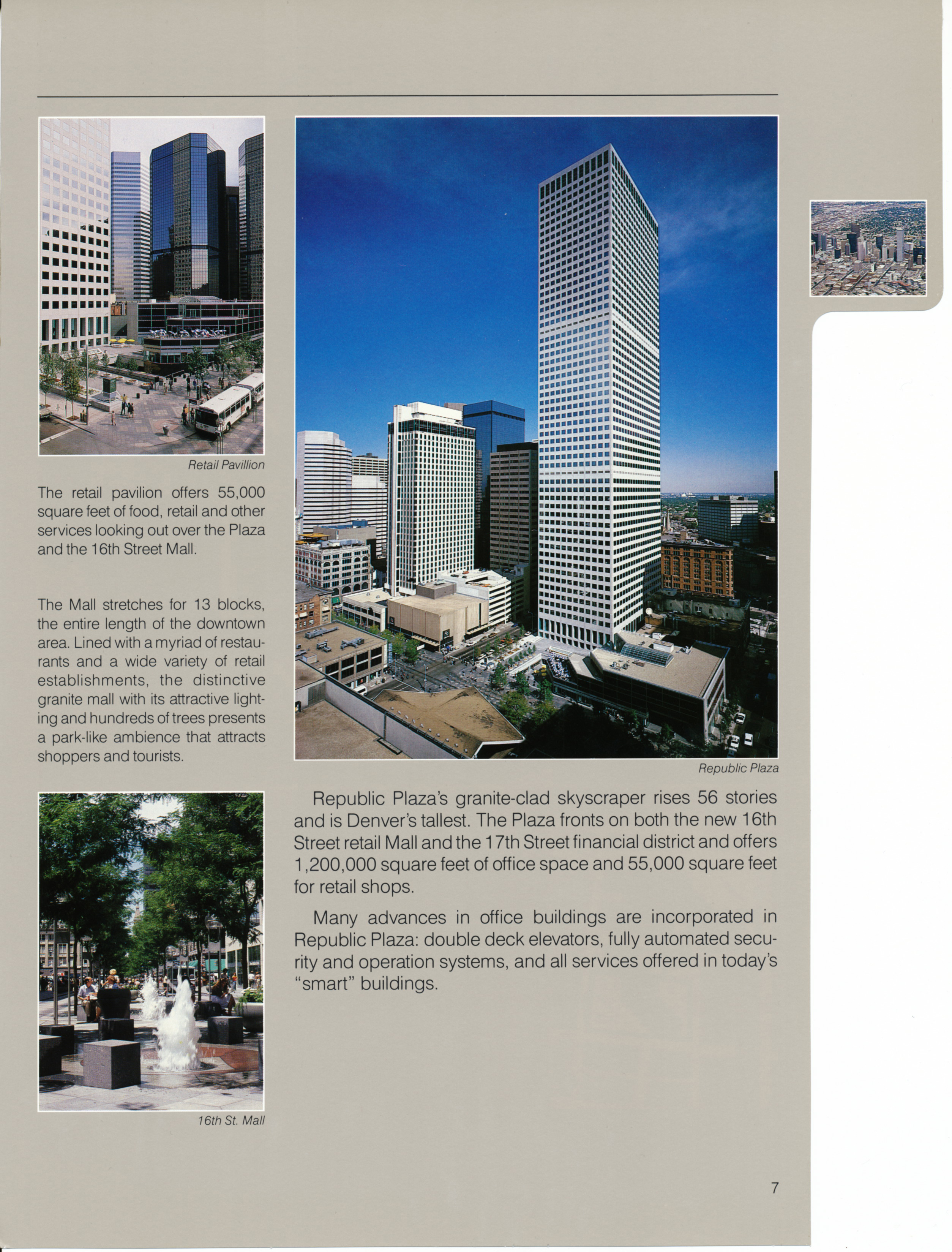
Pages of projects in DENVER / Republic Plaza, Denver Square, Dome Towers
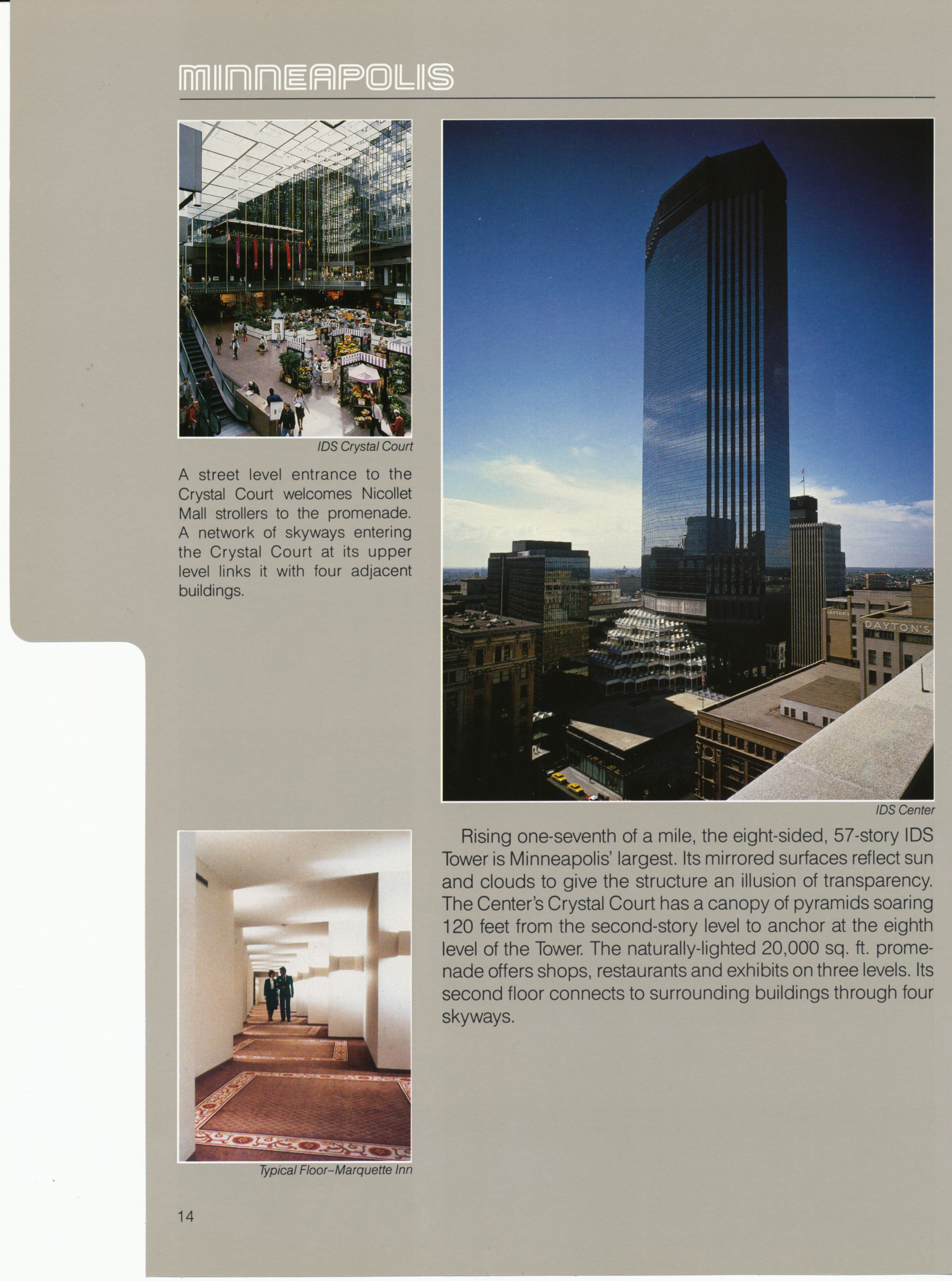
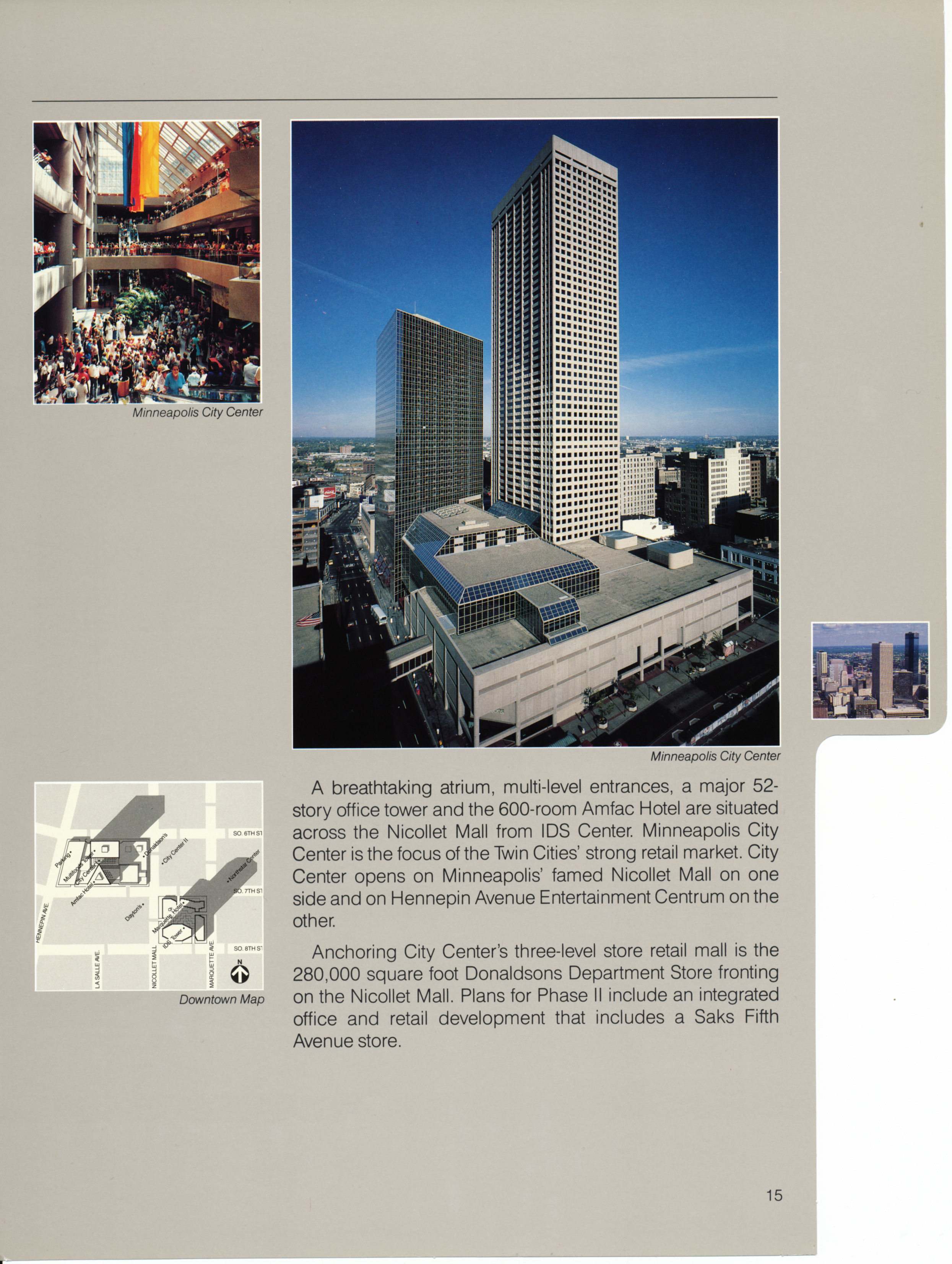
Pages of projects in MINNEAPOLIS / IDS Center, City Center
PROJECT MARKETING MATERIALS
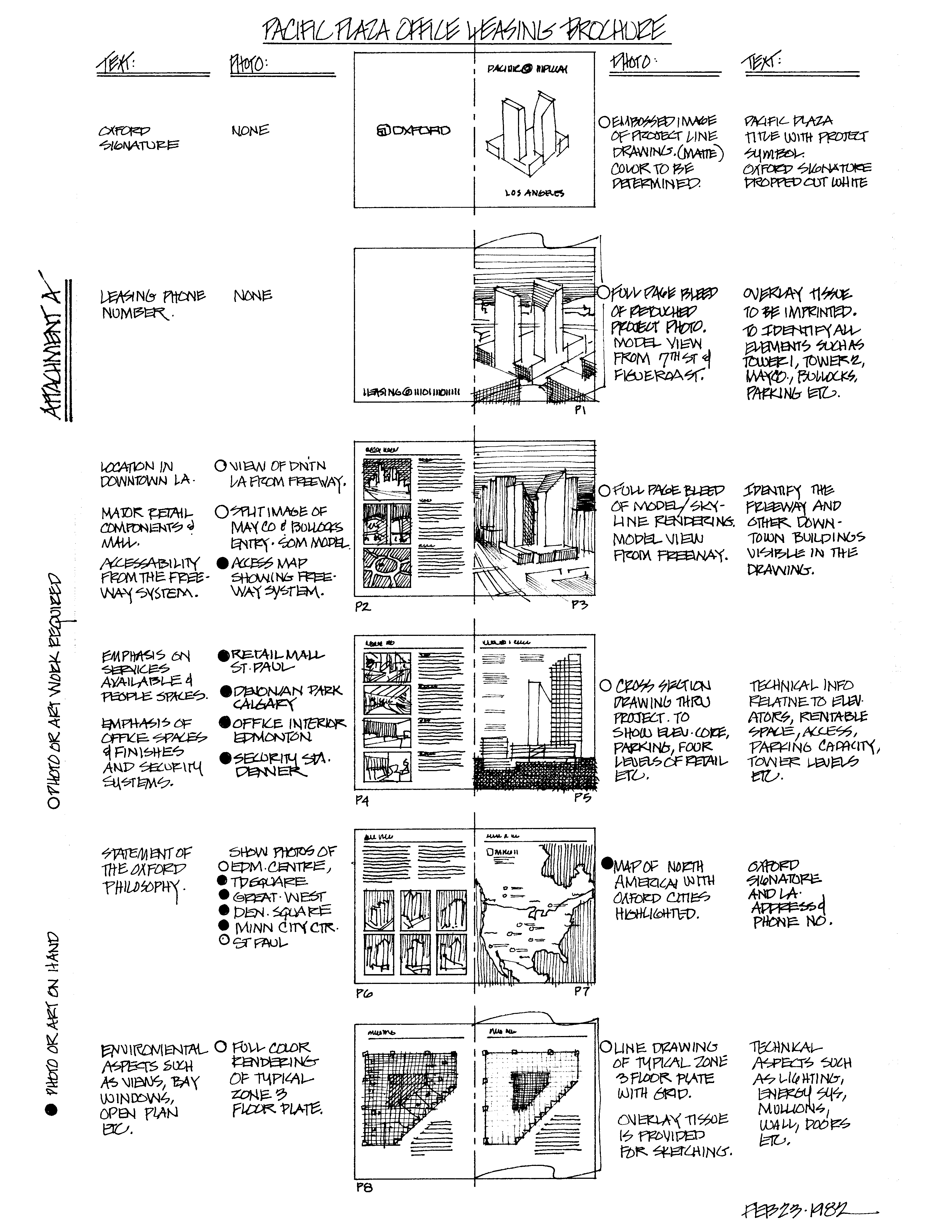
A typical page by page storyboard sketch outlining a planned project brochure’s photos, section drawings, maps and text.
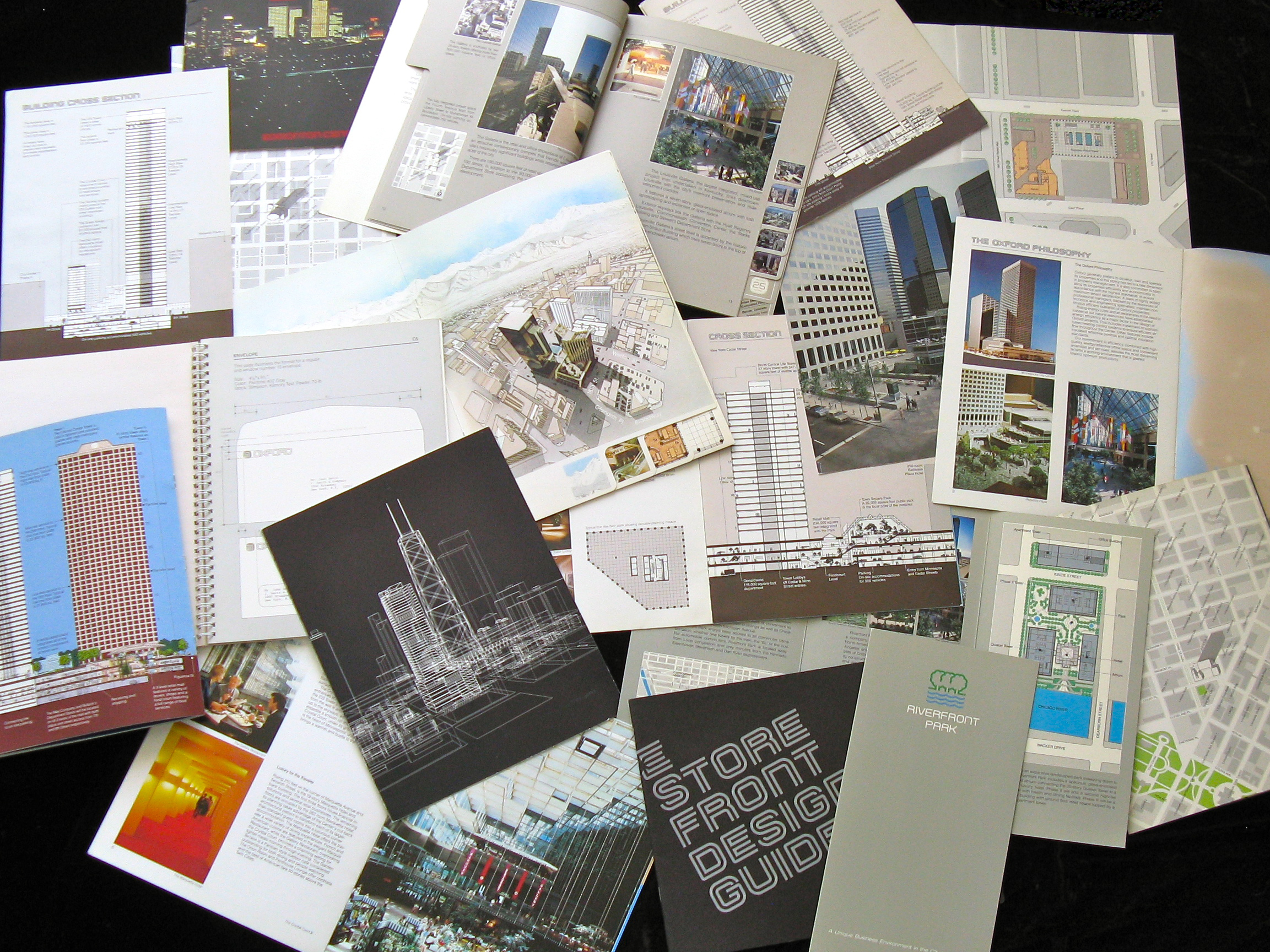
20+ Project brochures have been designed for OXFORD’s properties in the US and Canada. Averaging 8 to 12 pages, they illustrate the overall development with models, building cross-sections, floor plans, photos of local amenities and maps.
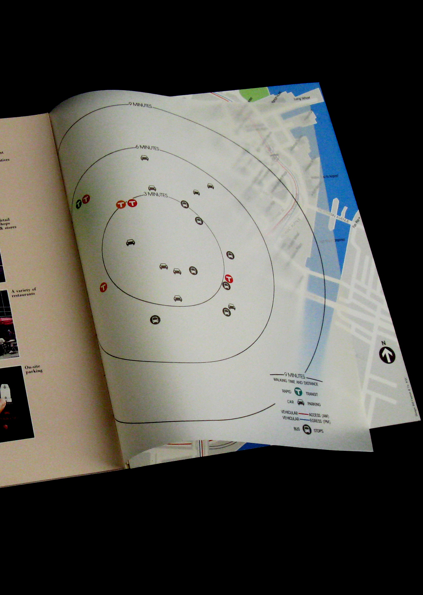
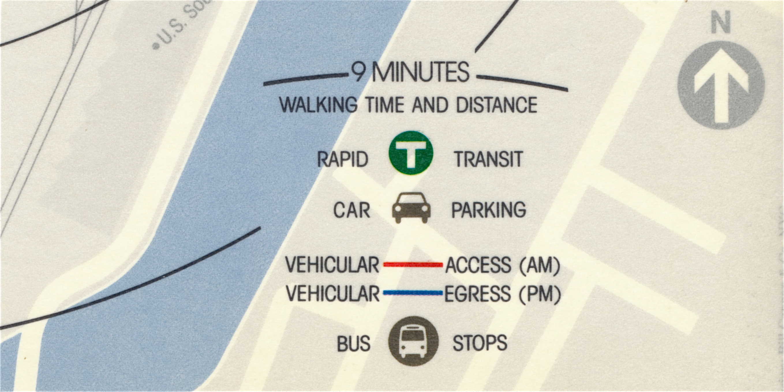
Typical map style with overlay showing Time & Distance and Transportation information.
EDMONTON
EDMONTON CENTER
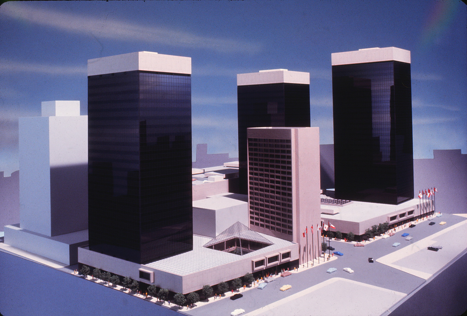
Edmonton Center is a phased mixed-use development combining three office towers, a hotel and three levels of retail with on-site parking.
Our initial program for Oxford Properties. The development of a symbol for this project became the building block for the Oxford corporate identity program.
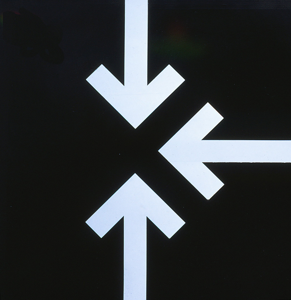
The development of a project symbol for Edmonton Center focused on combining the letter
E and three converging arrows to denote a
central focal point.
E and three converging arrows to denote a
central focal point.
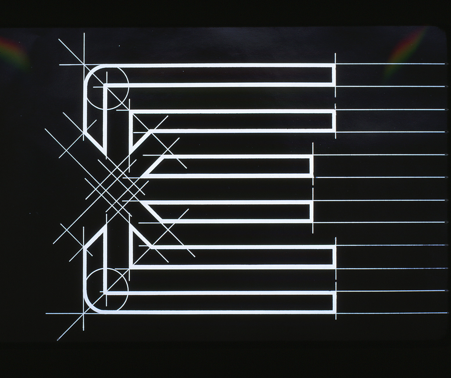
Geometric basis for symbol development
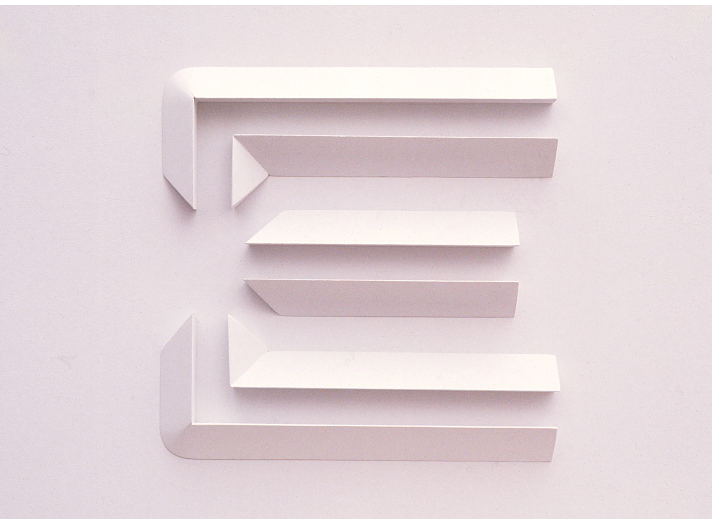
Dimensional application of
the symbol
the symbol
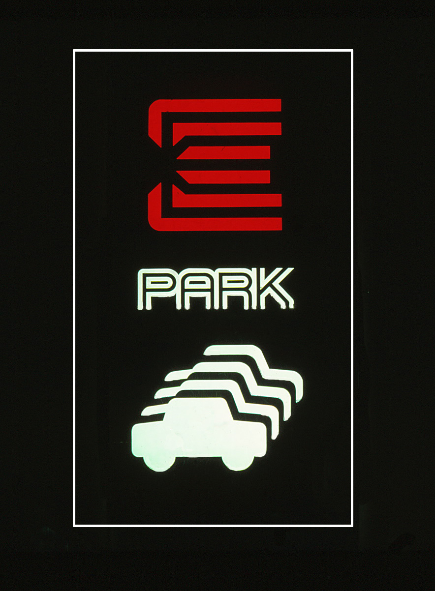
Parking garage entry sign
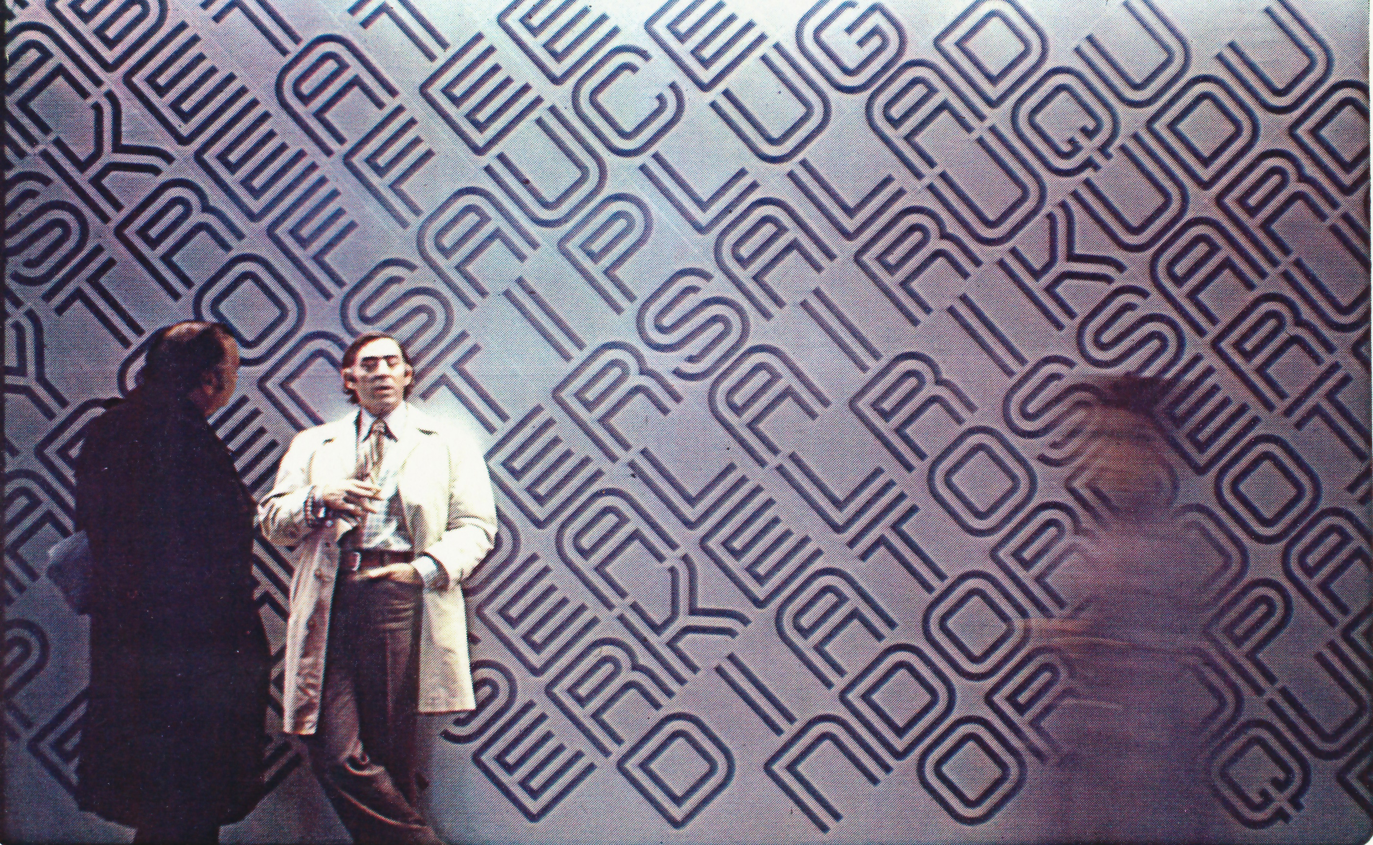
As part of the project marketing effort, a Word Puzzle contest was conducted using the temporary corridor walls in place during construction.
During the phased construction, temporary walls in the three level retail area featured large
scale painted graphics.
scale painted graphics.
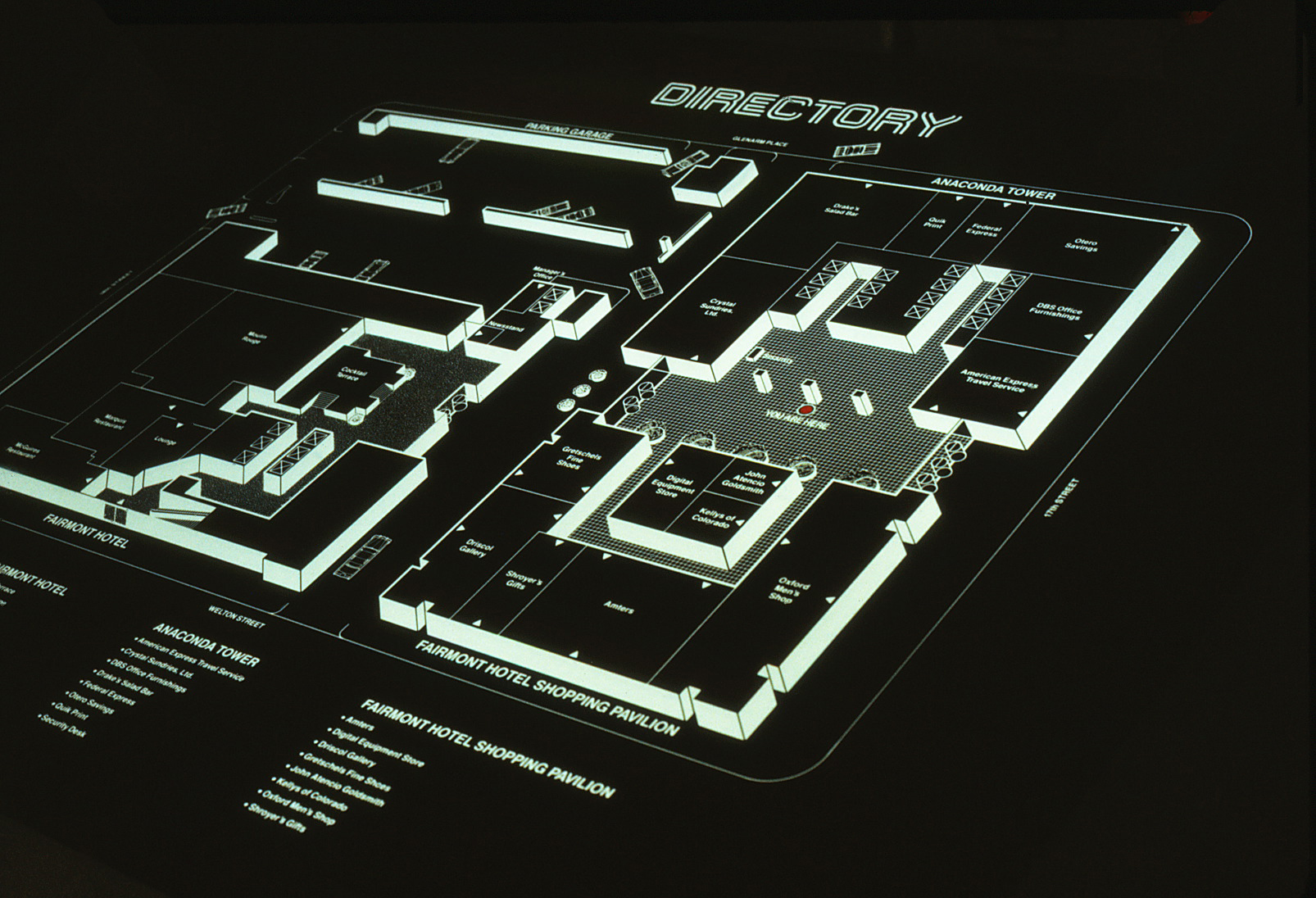
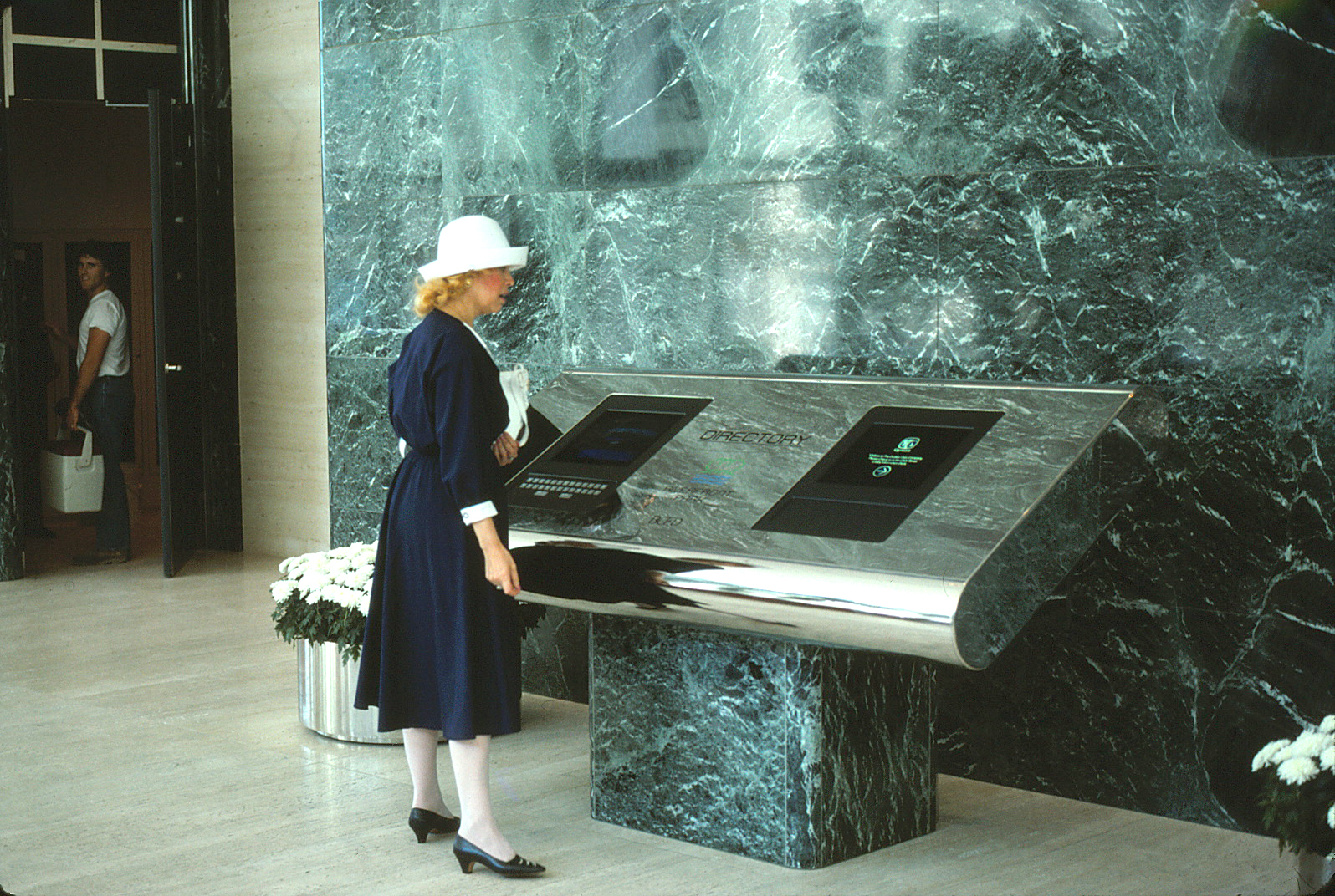
Designs for dimensional backlit Directories were updated as the
project progressed.
project progressed.
A single stroke font (bold & light) was derived from the geometry of the Oxford double stroke typeface.
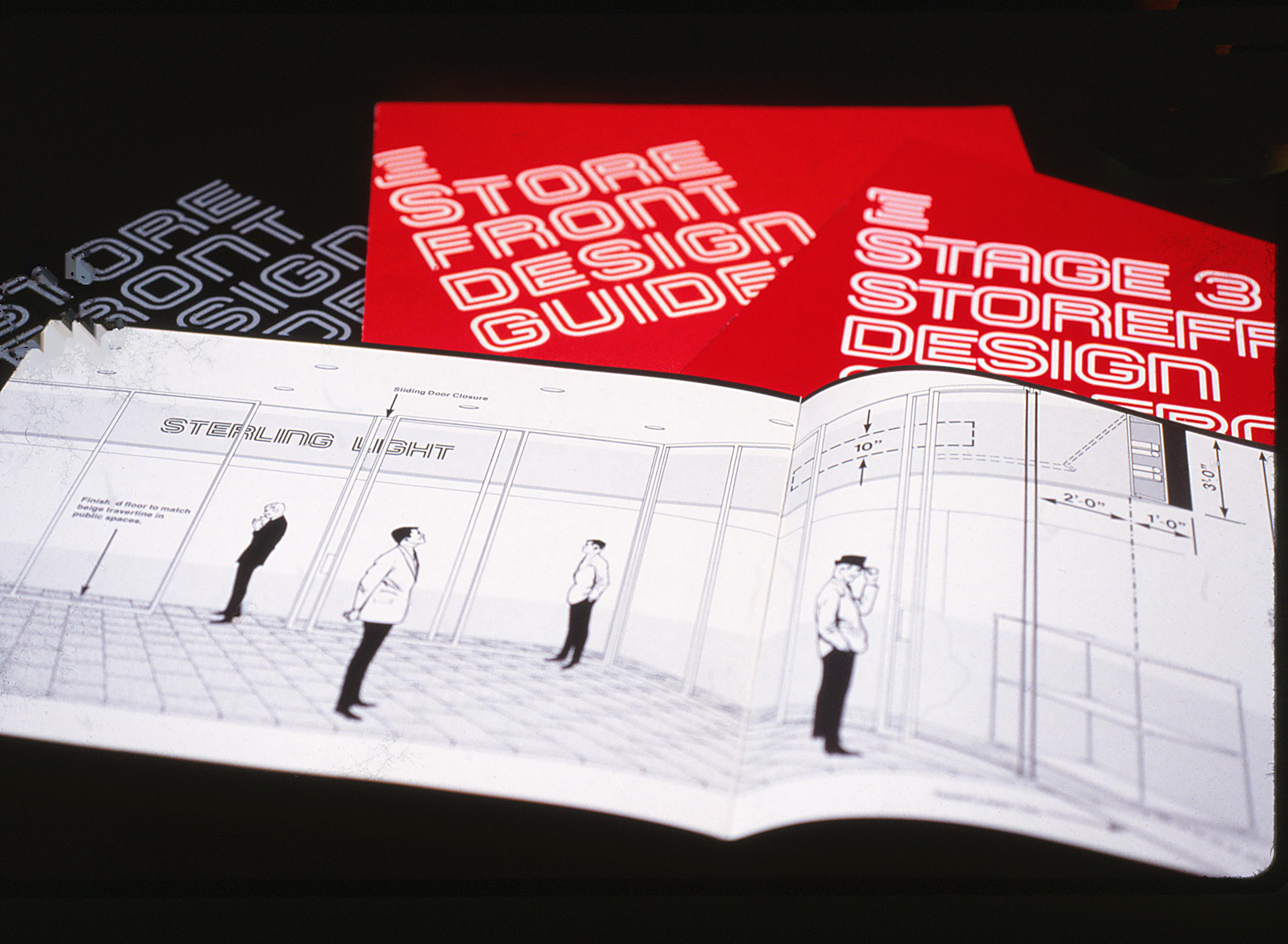
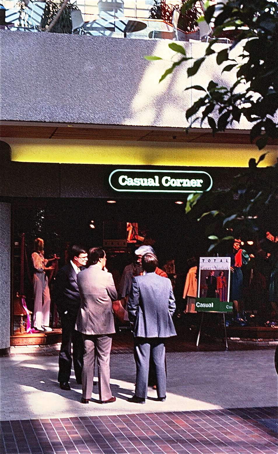
A Storefront & Signage Guidelines manual was developed for all retail spaces.
ARCHITECTURAL GRAPHICS
Etched in stainless steel elevator doors
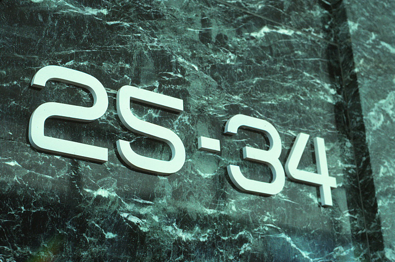
The symbol’s form and double stroke typography were then used in a variety of architectural applications for all future projects. The double stroke alphabet's geometry simplified fabrication.
A dimensional wall treatment at corporate headquarters
Etched on glass door handles
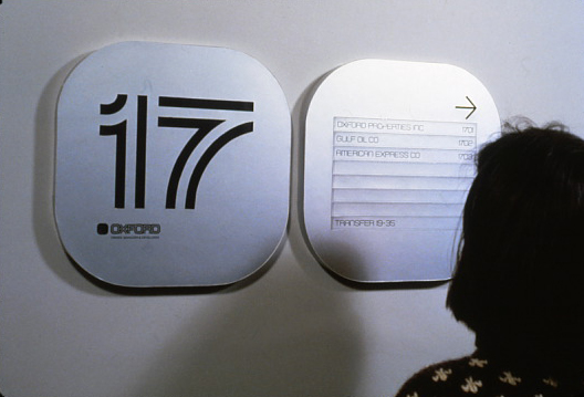
Etched Floor Level panels are paired with Tenant Directories identifying individual tenants. A changeable slat system allows for periodic updates.
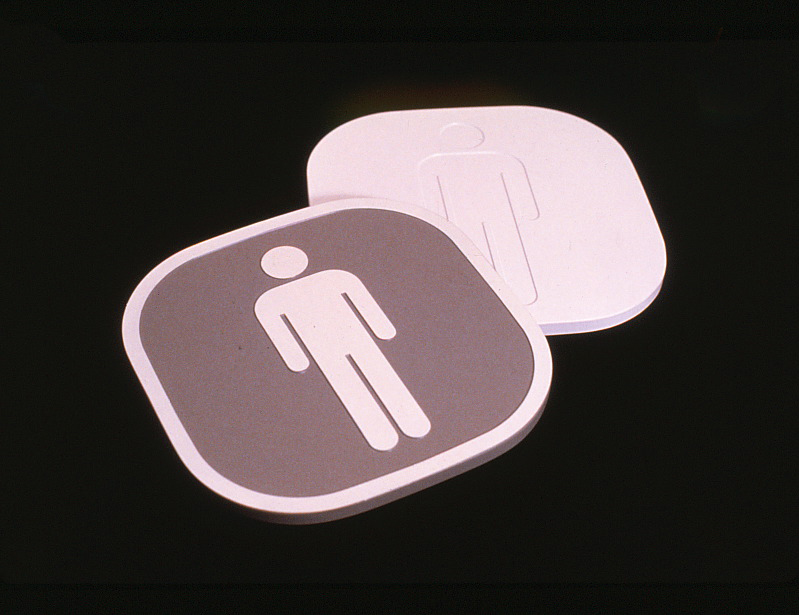
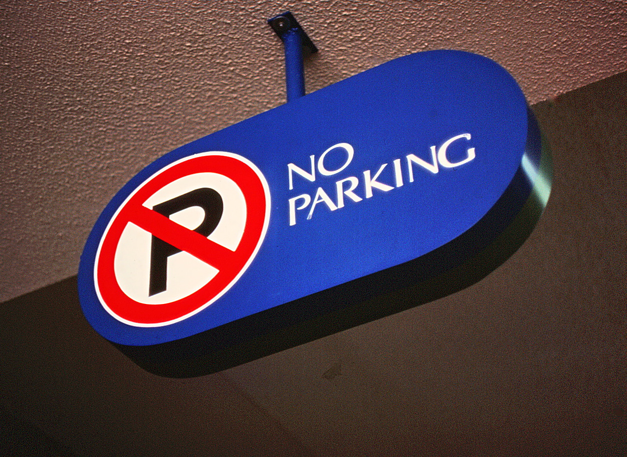
Wall or door mounted Pictogram Signs identify services, stairways and other utilities. Braille and symbol are dimensional to meet all (ADA) building codes for the handicapped.
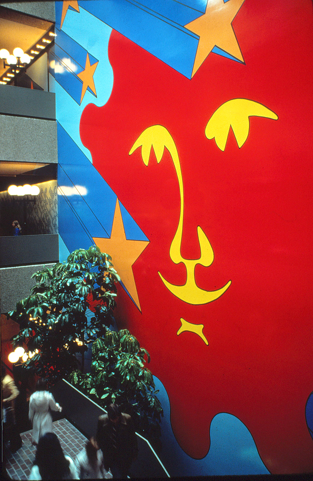
OTHER APPLICATIONS
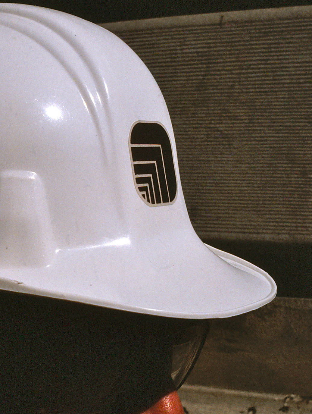
Construction helmets & equipment
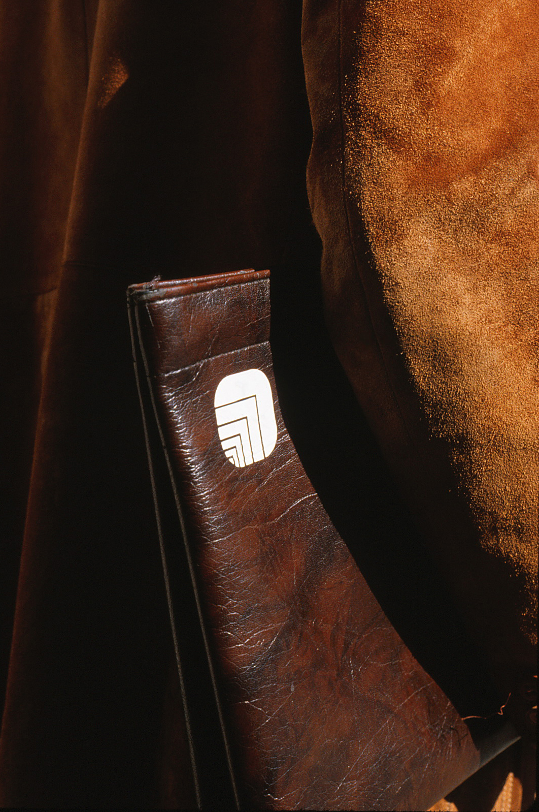
Project binders, folders and briefs
The Corporate symbol used in a variety of Promotional & Marketing items.

Marketing items such as etched glassware
Assorted promotional items
TYPICAL PROJECT ELEMENTS
OXFORD retained BC&CO to develop Wayfinding graphics and information systems for 9 major retail / office tower complexes in the US and CANADA.
Items included Project Symbols, Environmental Graphics, Interior Signage, Directories, Parking & Tenant Graphics. Typical examples shown below.
CHICAGO
QUAKER TOWER / RIVERFRONT PARK
Interactive Directory for Quaker Tower
Single stroke numbers
identify elevator banks.
identify elevator banks.
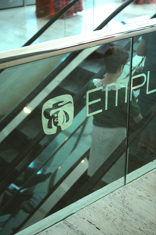
The Quaker Symbol, as the major tenant, is adapted in a variety of applications. All other graphics and signage use the standard OXFORD design elements.
Etched stainless steel elevator doors
Etched glass escalator wall
Riverside Park symbol & logotype
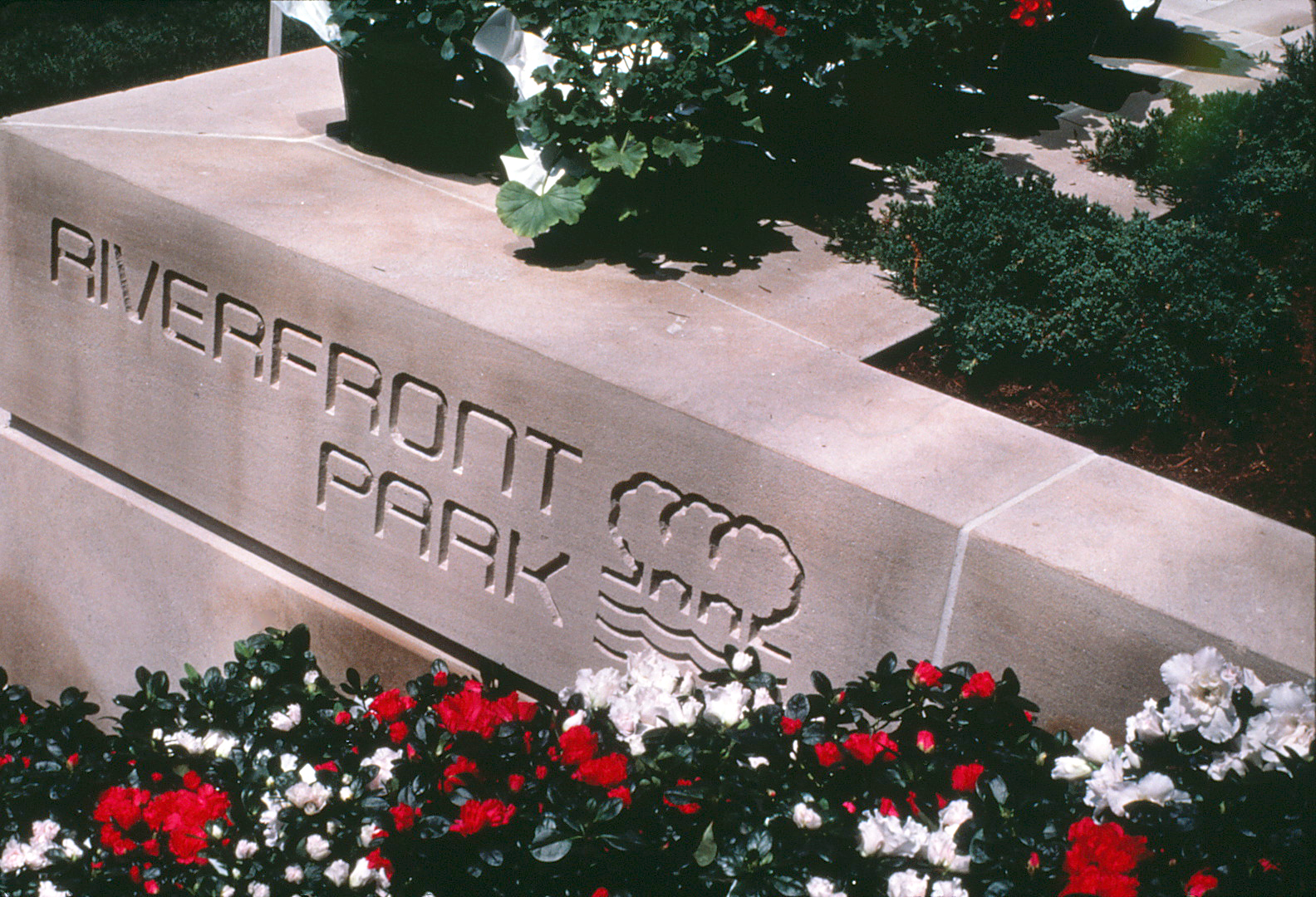
The Riverside Park Symbol was developed for the project amenity along the Chicago River.
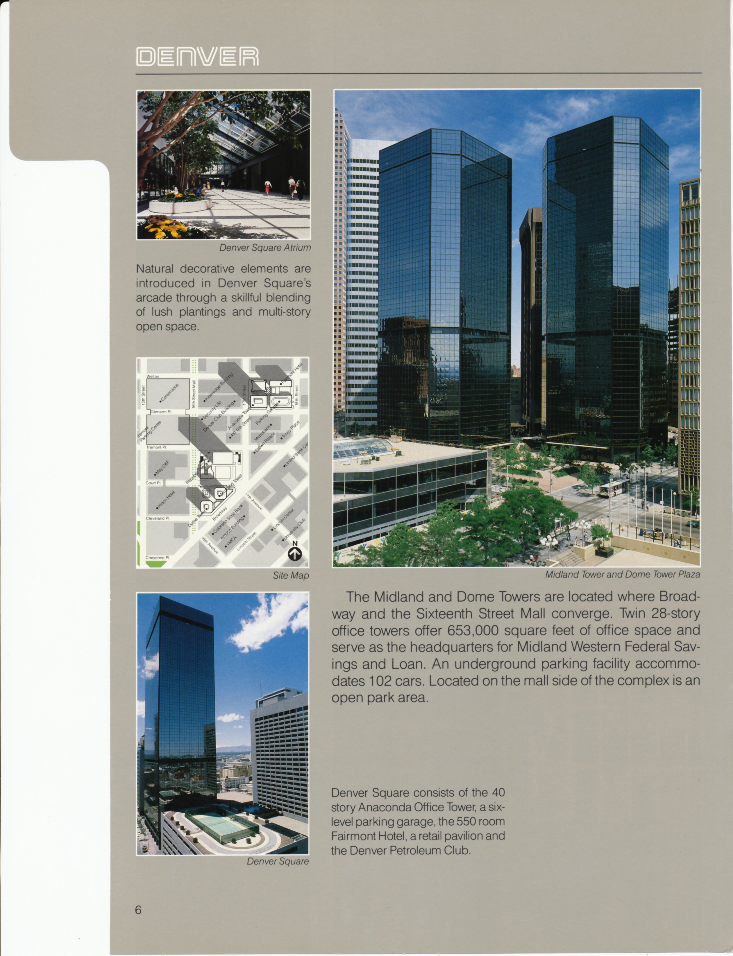
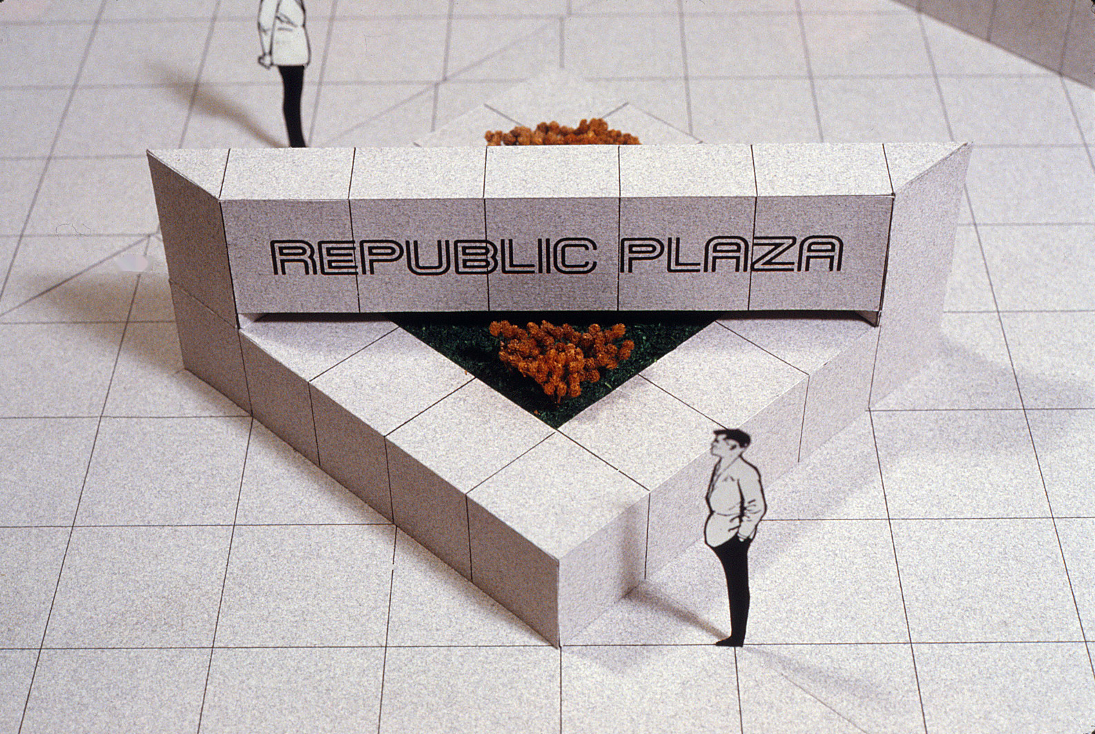
DENVER
REPUBLIC PLAZA / DENVER SQUARE
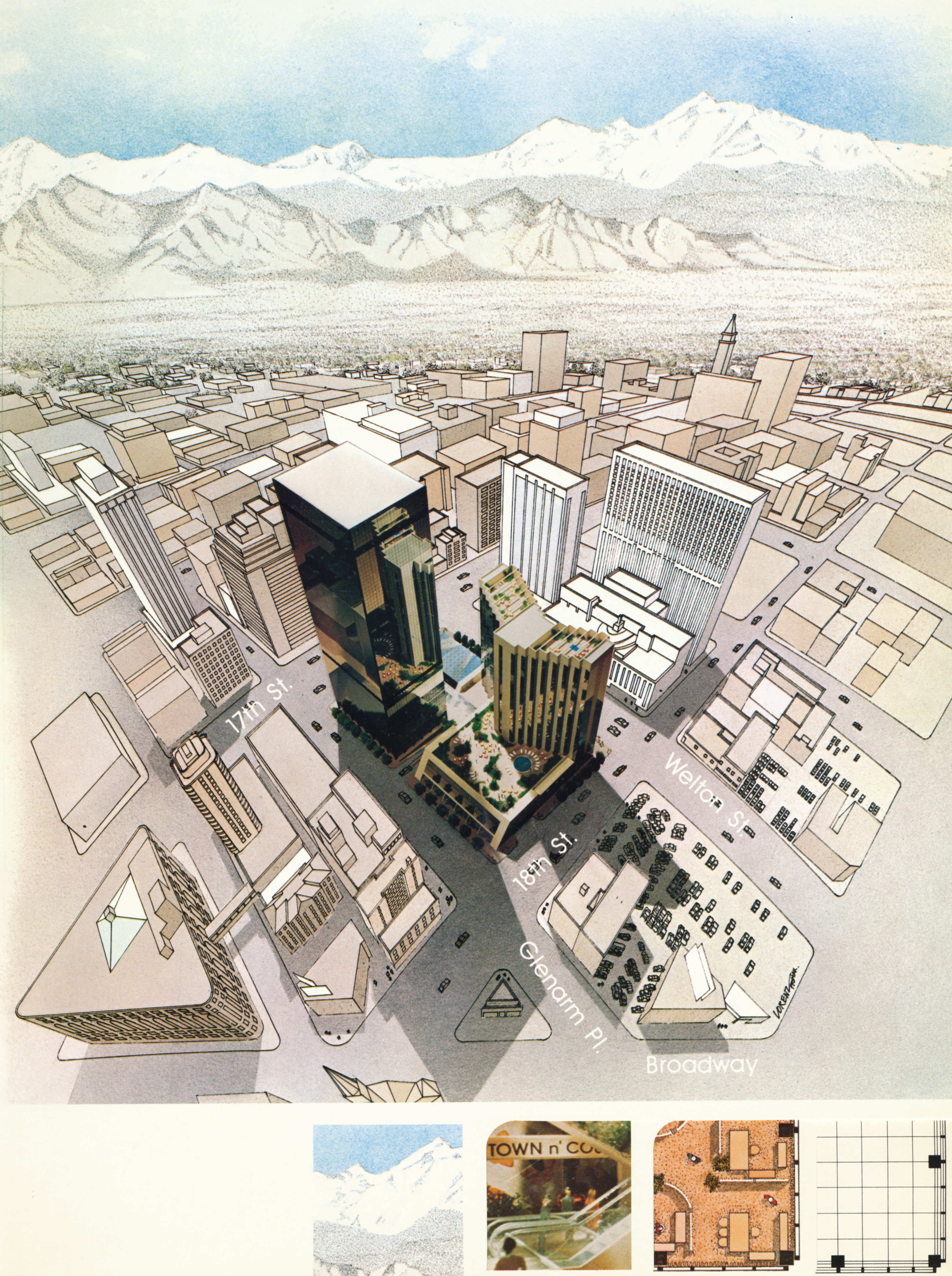
Tabbed Denver Square brochure with an architectural model photo dropped into a rendered view of downtown Denver.
Included building cross-section, floor plans and map. The project was later renamed Republic Plaza.
Included building cross-section, floor plans and map. The project was later renamed Republic Plaza.
Initial proposal for project logotype. Project name later changed.
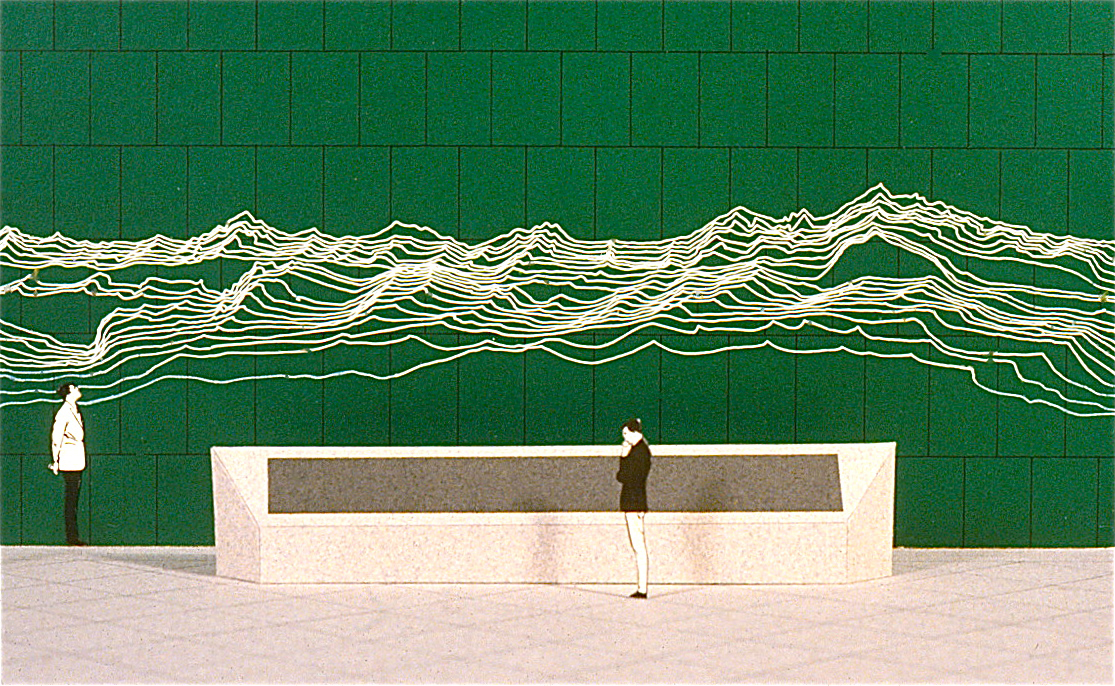
Two proposals for Rocky Mountain wall mural at entry.
Typical directory for retail mall
Project Entry Sign / Planter
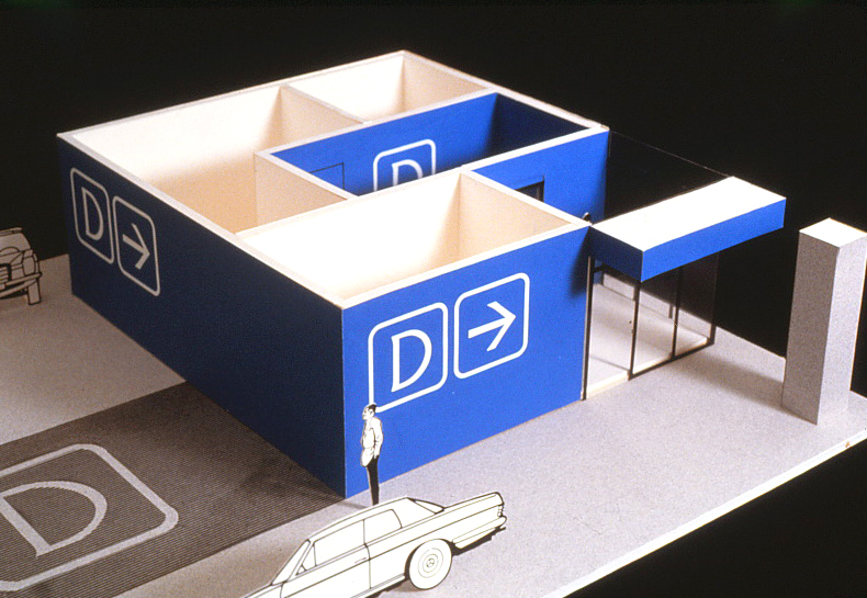
Parking Garage Directionals

Above: Dimensional build up of individual layers. Both concepts were rejected for cost considerations.
Left: Etched marble with off white filled graphic.
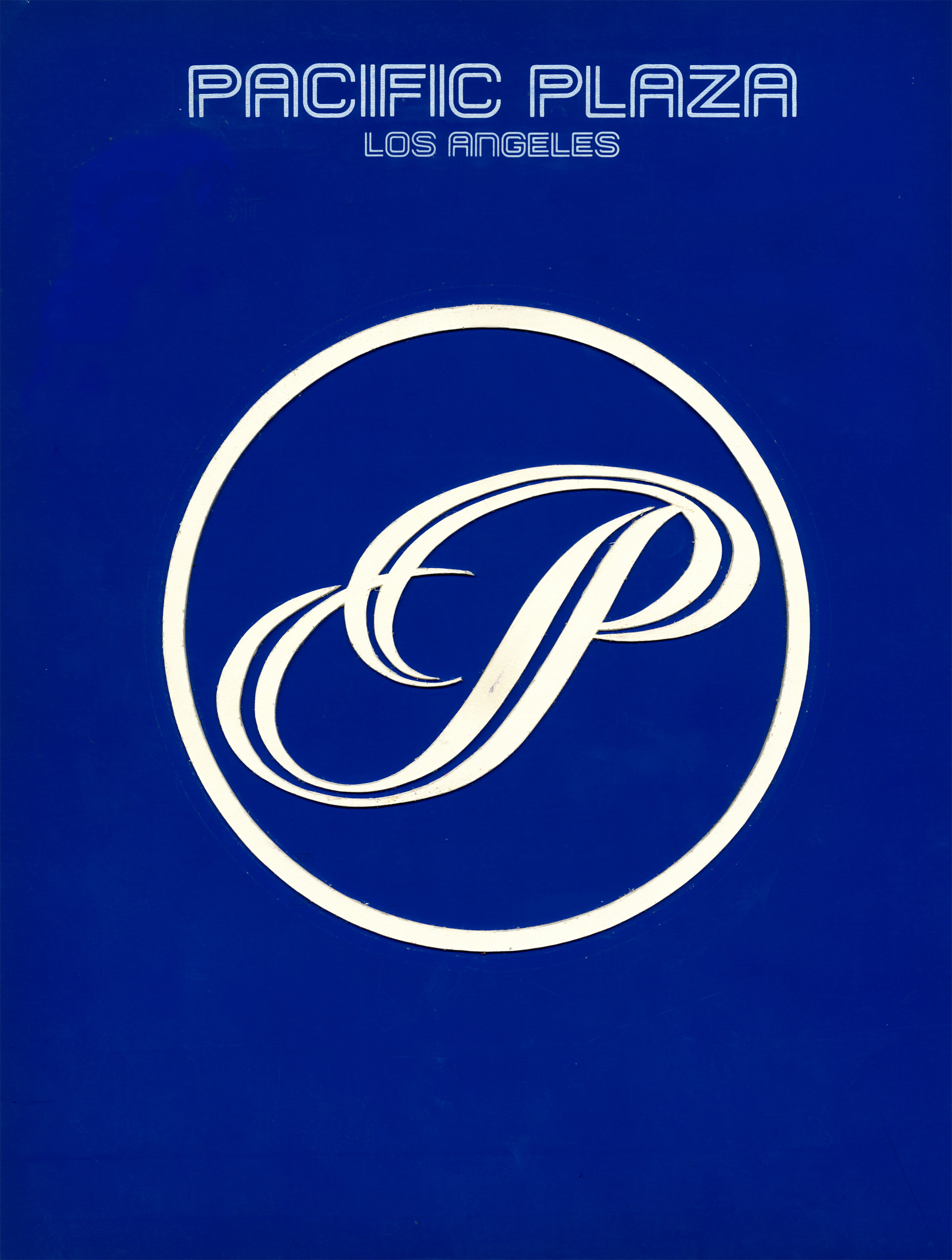
LOS ANGELES
PACIFIC PLAZA / CITICORP PLAZA / PLAZA COURT
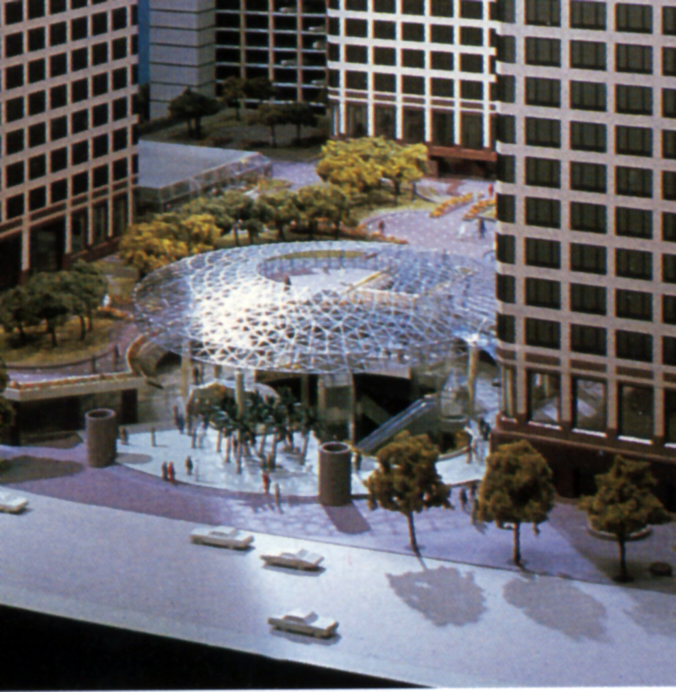
Projected to be a complex of three Office Towers, the Identity program focused on the multi-level retail component on Figueroa between 7th. and 8th. Streets.
The project symbol evolved from the linear “Trellis” structure marking the Plaza Court retail entrance at street level.


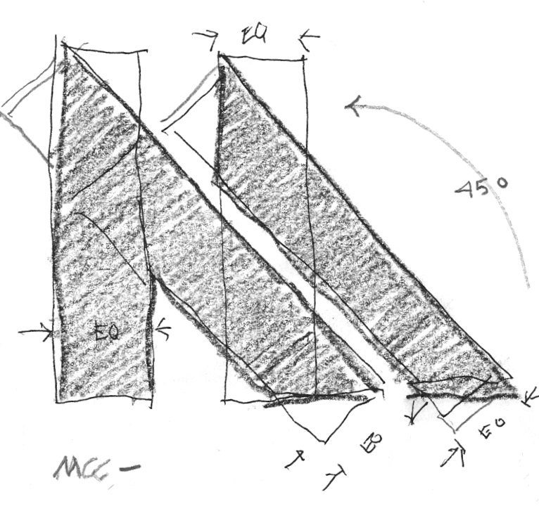
The three initial symbol concepts for
Pacific Plaza were rejected after the project’s name was changed to Citicorp Plaza.
Pacific Plaza were rejected after the project’s name was changed to Citicorp Plaza.

The project symbol design was modified for use on promotional banners and flags.
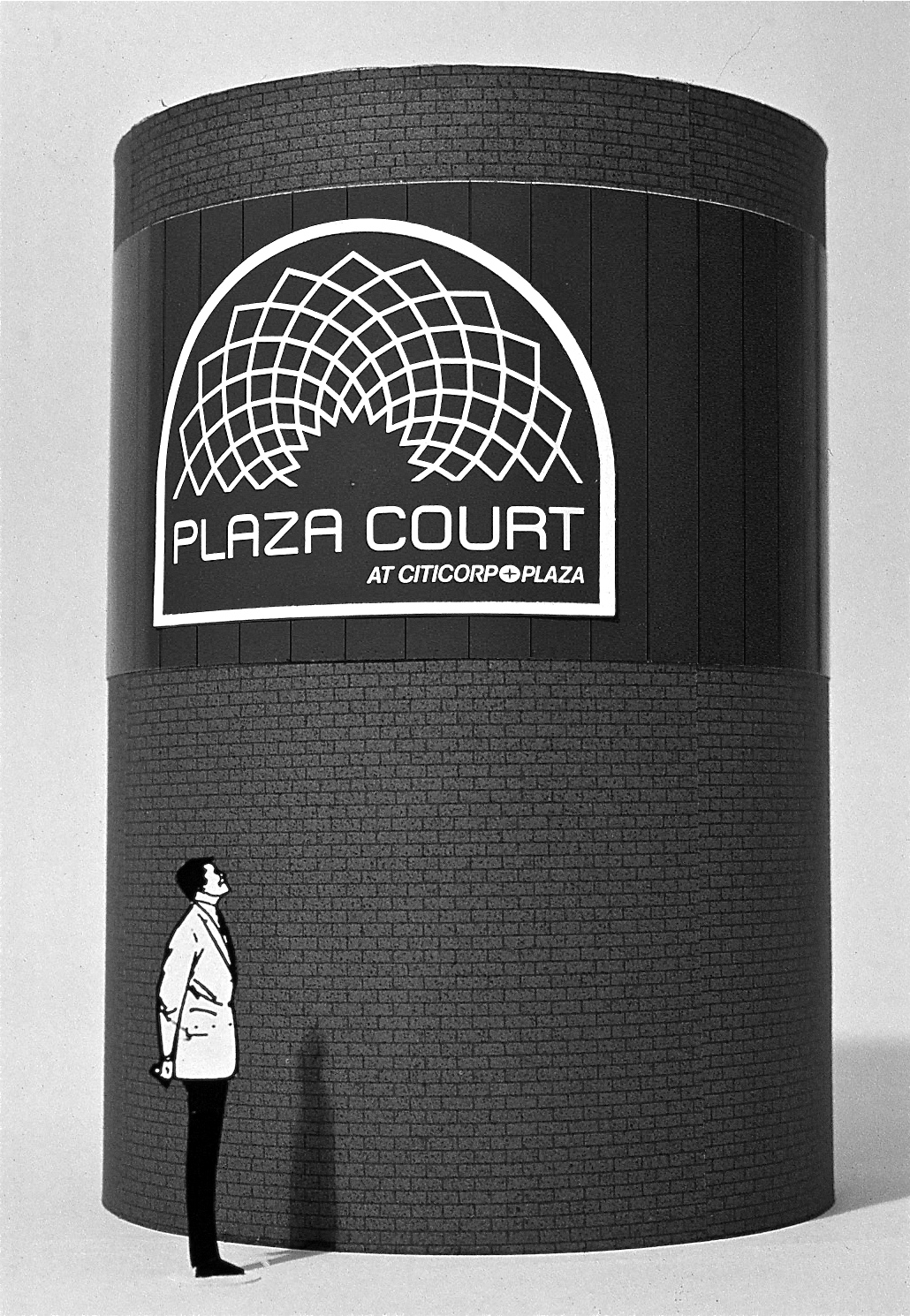
Retail identity applied to streetside vent tower.
MINNEAPOLIS
MINNEAPOLIS CITY CENTER
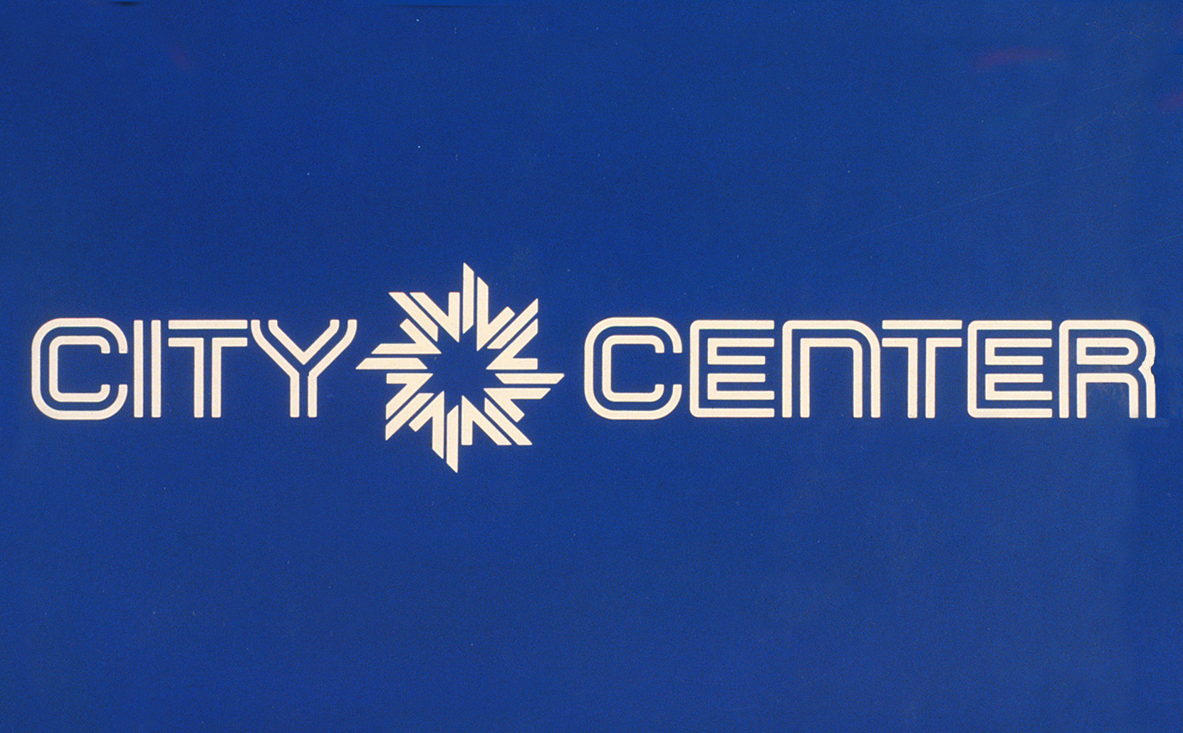
Minneapolis City Center signature
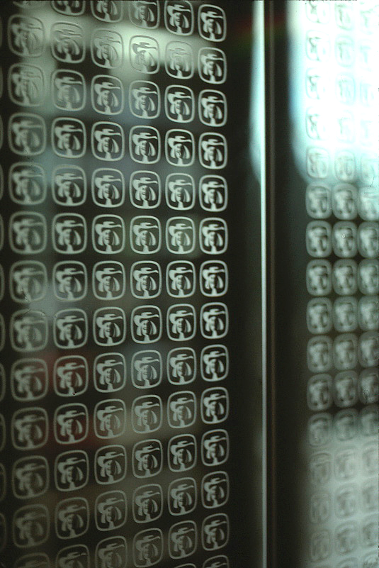
“M” Sketch

“M” repeats eight times to create symbol.
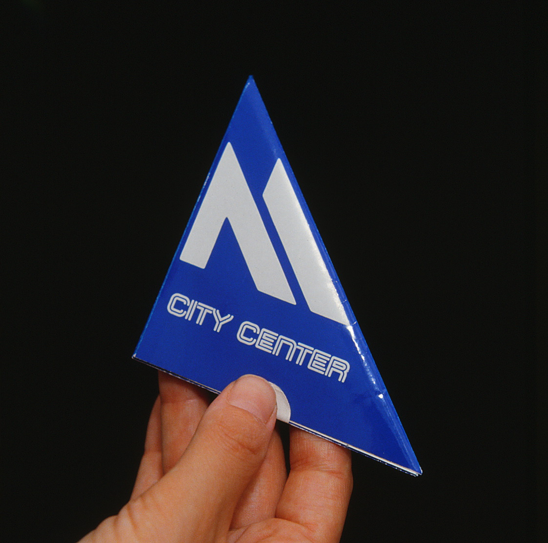
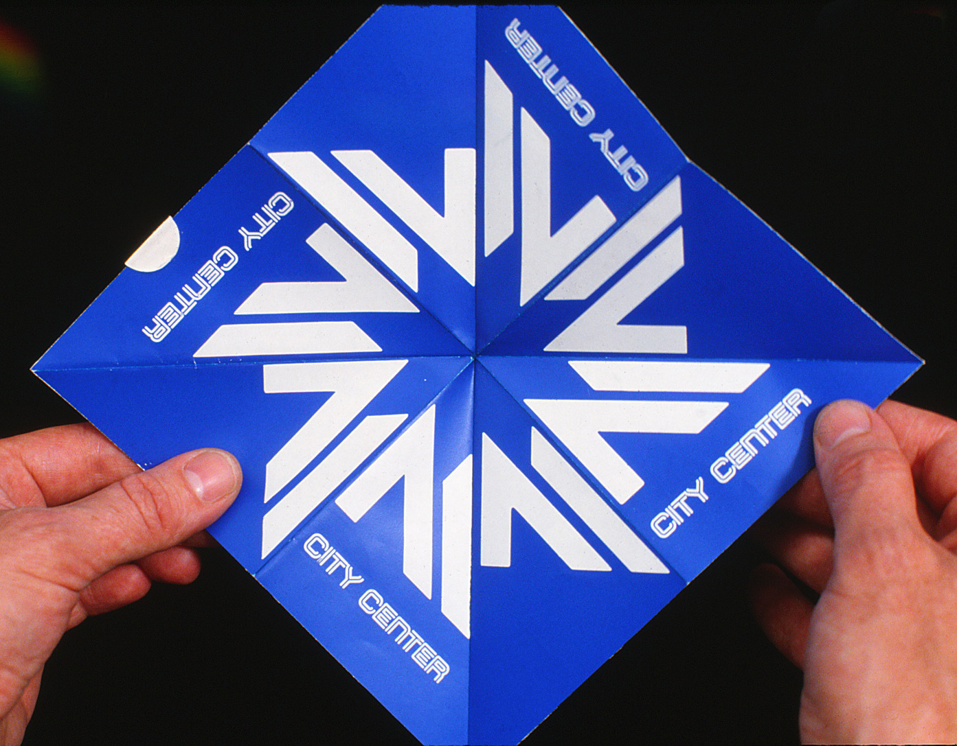
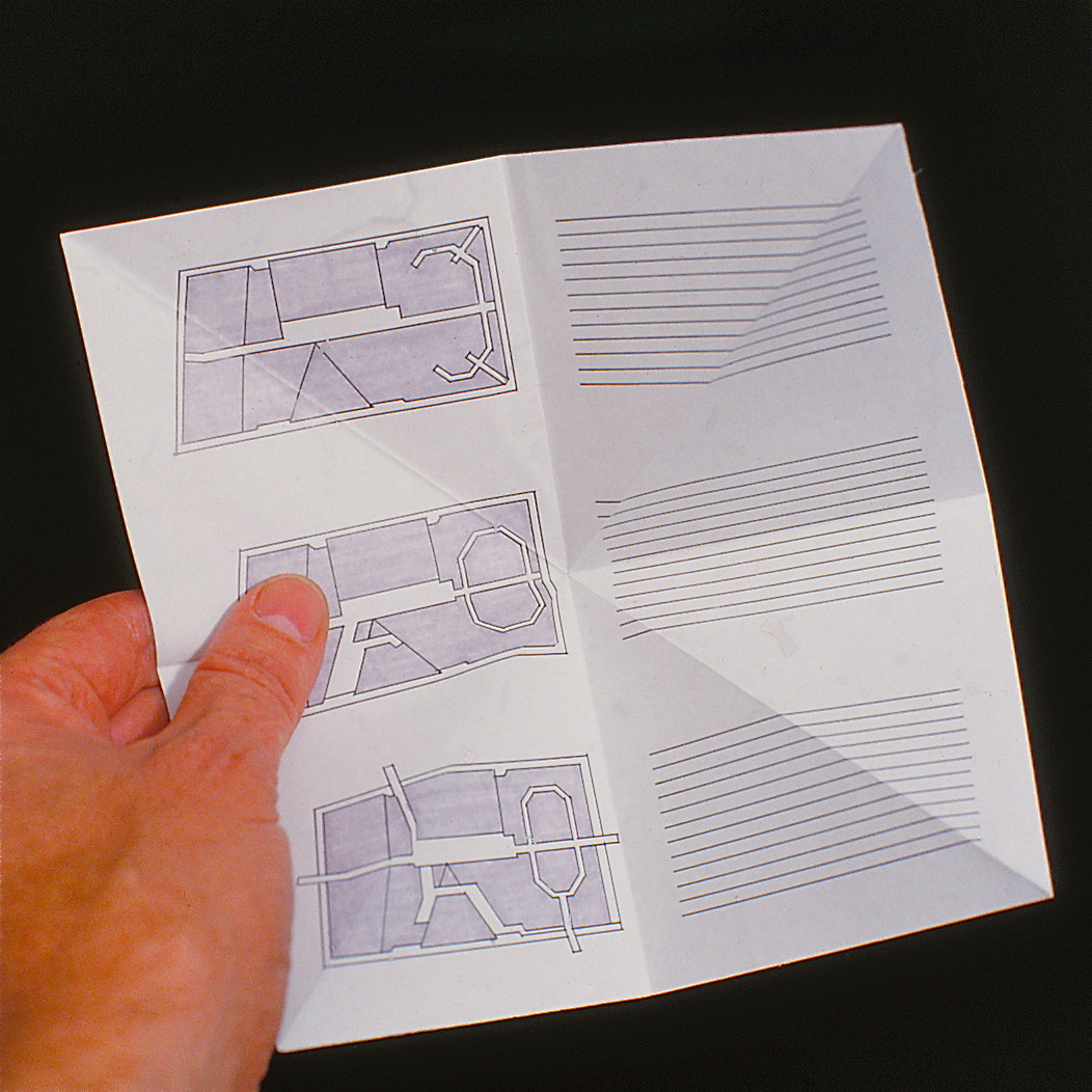
Opening day handout
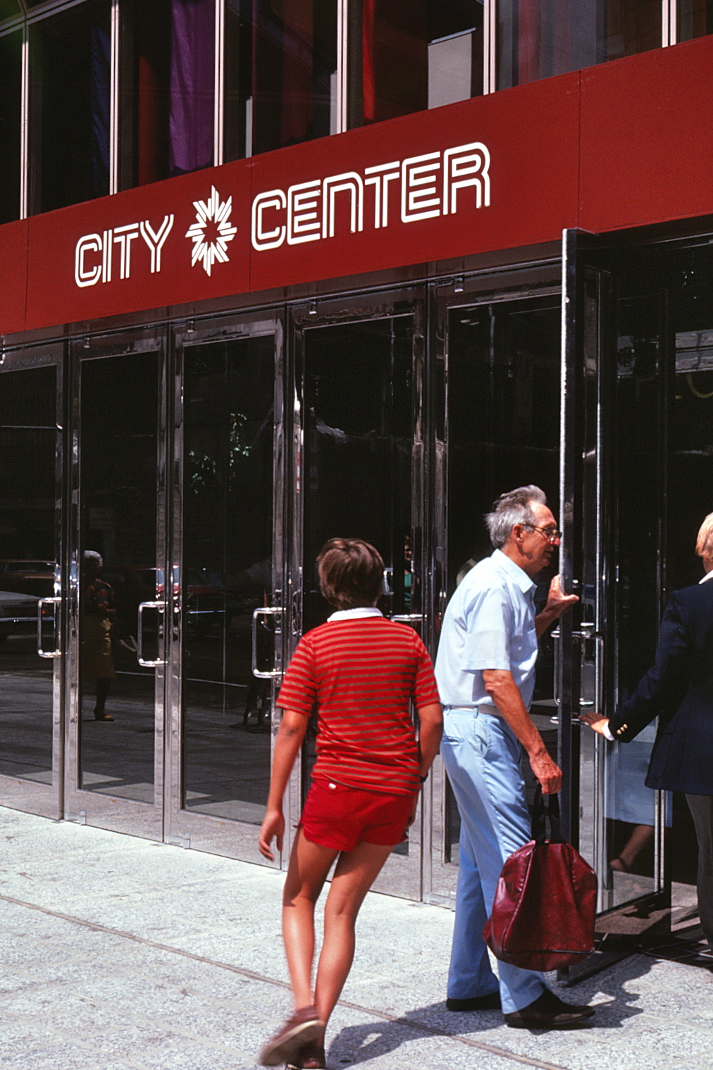
Identification at entry
to retail mall
to retail mall
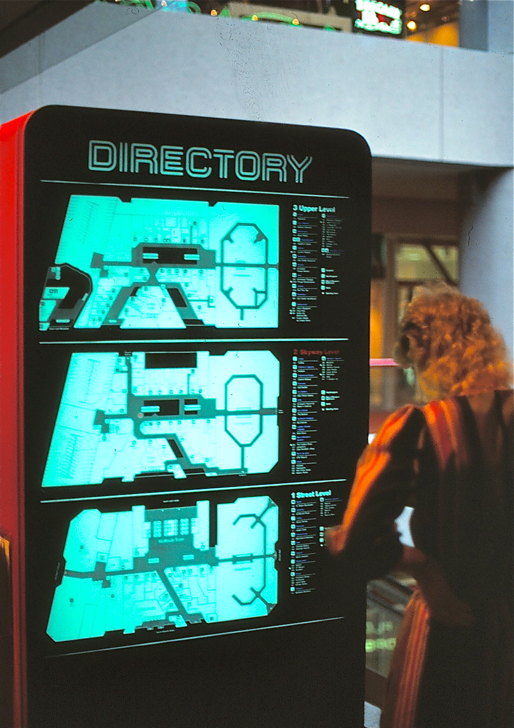
Backlit Directory, located at all escalators, listing shops on three levels of the mall.
A variety of promotional items prepared
for the project’s opening day.
for the project’s opening day.
SAINT PAUL
TOWN SQUARE
The Town Square symbol evolved from the terraced Public Park that was part of the retail complex.
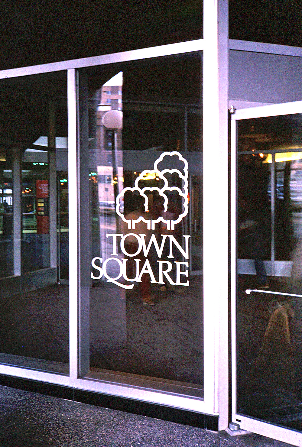
The project symbol applied to interior walls and glazing
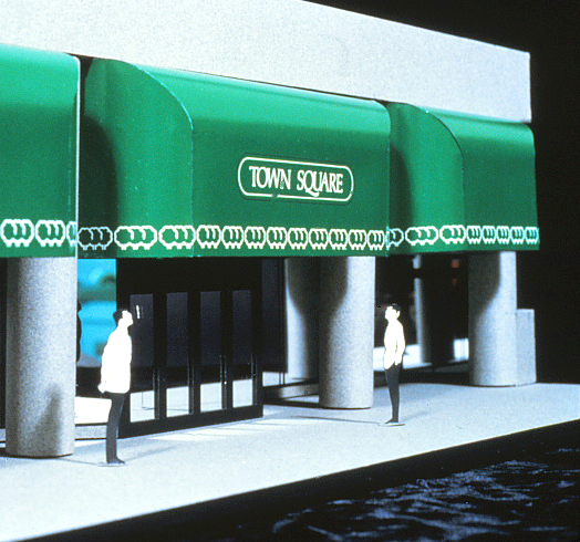
Variations of the symbol were used on canvas canopies to identify the multiple entries to the Office & Retail complex.
Retail sign standards were set using backlit oval signs.
Parking Garage graphics were also developed for the complex, which included two Office Towers, a Radisson Plaza Hotel, a three level 236,000 square foot retail area and a 500 car parking garage. The 30,000 square foot Town Square Park was a project amenity open to the public.
CONCLUSION
Our twenty year involvement with Oxford Properties ended with their sale to Bell Canada Enterprise Development (BCED).